Meta Horizon Developer Center UI/UX Redesign
Lost in the Metaverse: Rescuing Developers from Documentation Chaos
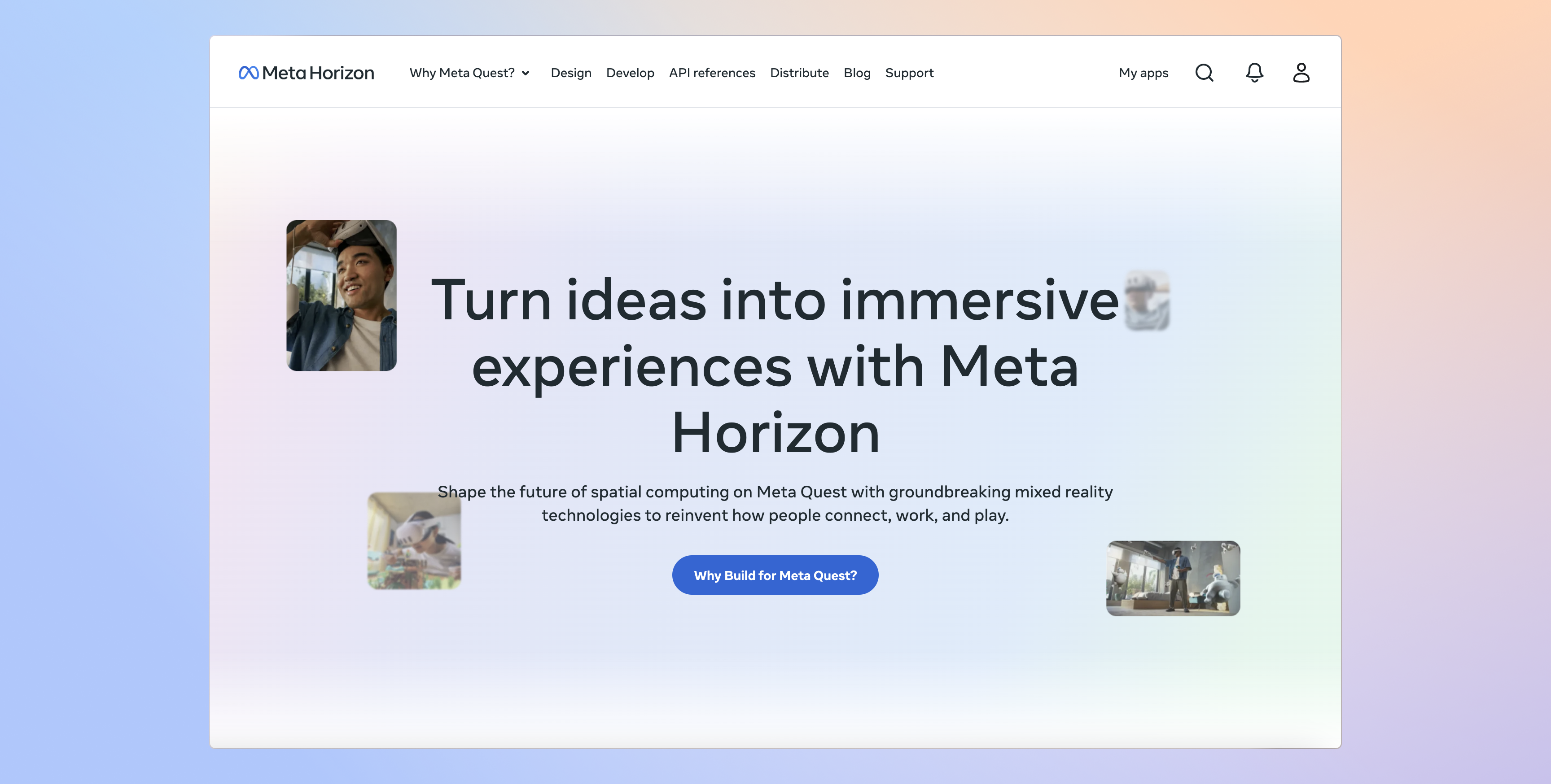
Building for the metaverse is a monumental task. In 2023, as Meta ramped up its efforts to build Horizon OS, the underlying platform for immersive VR/MR experiences, a critical bottleneck emerged: the developer experience. The Meta Horizon Developer Center (MHDC), the primary resource for developers building on the platform, was failing to keep pace. Instead of empowering creators, it was hindering them. This is the story of how we transformed the MHDC from a source of frustration into a catalyst for innovation, completed in a rapid 8-week sprint leading up to Meta Connect 2024.
The Problem
Lost in the Documentation Maze
Imagine you're a developer, eager to create the next groundbreaking VR/MR experience. You dive into the Meta Horizon Developer Center, looking for guidance on a specific SDK. Instead of clear instructions, you encounter:
Lost in the Documentation Maze
Imagine you're a developer, eager to create the next groundbreaking VR/MR experience. You dive into the Meta Horizon Developer Center, looking for guidance on a specific SDK. Instead of clear instructions, you encounter:

A Labyrinth of Links
Documentation was scattered across multiple sites and platforms (internal wikis). There was no clear hierarchy or navigation. Finding the right information felt like navigating a maze.
Documentation was scattered across multiple sites and platforms (internal wikis). There was no clear hierarchy or navigation. Finding the right information felt like navigating a maze.

Inconsistent Branding
The visual design and terminology varied wildly between different sections, creating a disjointed and unprofessional experience. It felt like exploring a patchwork quilt, not a cohesive platform.
The visual design and terminology varied wildly between different sections, creating a disjointed and unprofessional experience. It felt like exploring a patchwork quilt, not a cohesive platform.

Broken Search
The search functionality was unreliable, often returning irrelevant results or no results at all. Developers were left to manually sift through pages of documentation.
The search functionality was unreliable, often returning irrelevant results or no results at all. Developers were left to manually sift through pages of documentation.

Outdated Information
Some documentation was out-of-date, leading to confusion and wasted development time.
Some documentation was out-of-date, leading to confusion and wasted development time.

Lack of Clear Learning Paths
New developers struggled to understand where to begin. There were no structured learning paths to guide them through the platform's capabilities.
New developers struggled to understand where to begin. There were no structured learning paths to guide them through the platform's capabilities.
The MHDC was more than just a documentation problem; it was a strategic liability. This was actively costing Meta development time, and potentially, the ability to recruit and retain top VR/MR developer talent. A poor developer experience could stifle innovation and push developers towards competing platforms.
My Role
Architect, Builder, and Advocate
As a UX/UI Designer within the Horizon OS organization (specifically, the Developer Education and Lifecycle pillar, Developer Education and Workflow Tools pod), I took on the challenge of leading the MHDC redesign. This wasn't just a design project; it was a rescue mission. I acted as a:

UX/UI Designer
I was responsible for the overall information architecture, user flows, visual design, and interaction design of the new MHDC.
I was responsible for the overall information architecture, user flows, visual design, and interaction design of the new MHDC.

Project Manager
I facilitated collaboration between cross-functional teams (content designers, engineers, product managers) to ensure we stayed on track and met our deadlines.
I facilitated collaboration between cross-functional teams (content designers, engineers, product managers) to ensure we stayed on track and met our deadlines.
Front-End Engineer
I contributed directly to the codebase, fixing bugs and optimizing performance. This hands-on approach allowed me to bridge the gap between design and implementation.
I contributed directly to the codebase, fixing bugs and optimizing performance. This hands-on approach allowed me to bridge the gap between design and implementation.

Content Strategist (Partial)
I worked closely with content designers to ensure consistency in terminology, tone, and structure across all documentation.
I worked closely with content designers to ensure consistency in terminology, tone, and structure across all documentation.
Discovery
Developer Expectations in a New Reality
We knew the MHDC had problems, but anecdotal evidence wasn't enough. We needed to deeply understand the why behind the frustration. My initial hypothesis was that the rapid evolution of VR/MR technology, and Horizon OS itself, had outpaced the documentation, creating a widening gap between developer needs and the available resources. Developers' expectations for a smooth, intuitive development experience were increasing.
Deeper Insights
Uncovering the Pain Points
Before diving into design, we needed to understand the developers' pain points firsthand. A UX Researcher and I collaborated on the following research initiatives:
Uncovering the Pain Points
Before diving into design, we needed to understand the developers' pain points firsthand. A UX Researcher and I collaborated on the following research initiatives:

Usability Testing
I curated the test cases for the usability testing sessions, focusing on key user flows and potential pain points. We then observed 12 developers (a mix of experienced and novice Horizon OS developers) attempting to complete common tasks using the existing MHDC, such as finding API documentation, understanding setup procedures, and troubleshooting common errors.
I curated the test cases for the usability testing sessions, focusing on key user flows and potential pain points. We then observed 12 developers (a mix of experienced and novice Horizon OS developers) attempting to complete common tasks using the existing MHDC, such as finding API documentation, understanding setup procedures, and troubleshooting common errors.
Developer Surveys
The UX Researcher and I collaborated on the survey form design, including questions, prompts, and field types, to gather broader, quantitative feedback from 50 developers about their experiences with the MHDC. We asked about their frequency of use, their satisfaction levels, and their biggest pain points.
The UX Researcher and I collaborated on the survey form design, including questions, prompts, and field types, to gather broader, quantitative feedback from 50 developers about their experiences with the MHDC. We asked about their frequency of use, their satisfaction levels, and their biggest pain points.

Stakeholder Interviews
I led the one-on-one stakeholder interviews with product managers and engineers working on Horizon OS to understand their perspectives on the MHDC, their priorities, and any known technical limitations.
I led the one-on-one stakeholder interviews with product managers and engineers working on Horizon OS to understand their perspectives on the MHDC, their priorities, and any known technical limitations.

Competitive Analysis
In addition to the team's research, I conducted my own heuristic evaluations and competitive analysis of the developer portals of competing VR/MR platforms (e.g., Unity, Unreal Engine) to identify best practices and areas for differentiation.
In addition to the team's research, I conducted my own heuristic evaluations and competitive analysis of the developer portals of competing VR/MR platforms (e.g., Unity, Unreal Engine) to identify best practices and areas for differentiation.
Key Findings (Synthesized Insights):
Insight 1:
"I can't find anything!"
The overwhelming feedback, echoing across all research methods, was that the existing MHDC was incredibly difficult to navigate. Developers spent a disproportionate amount of time searching for information, hindering their productivity.
Insight 2:
"Is this even up-to-date?"
Developers lacked confidence in the accuracy and currency of the documentation. This uncertainty led to wasted time debugging issues that stemmed from outdated information and a reluctance to trust the platform.
Insight 3:
"I feel lost."
New developers, in particular, felt overwhelmed by the sheer volume of disorganized information and the lack of clear guidance on where to start. The onboarding experience was practically non-existent.
Insight 4:
"The search is useless." The search functionality was consistently cited as a major point of failure. Developers reported receiving irrelevant results, too many results, or no results at all.
Insight 5:
"It feels fragmented."
The inconsistent branding, terminology, and visual styles across different sections created a jarring and unprofessional experience, undermining developers' confidence in the platform.
Design Principles
Guiding the Transformation
Based on our research and the strategic goals of Horizon OS, we established four core design principles:
Guiding the Transformation
Based on our research and the strategic goals of Horizon OS, we established four core design principles:

Discoverability
Every piece of information should be easily findable, within a maximum of three clicks. This was paramount.
Every piece of information should be easily findable, within a maximum of three clicks. This was paramount.
Clarity
Documentation should be concise, jargon-free, and easy to understand, regardless of a developer's experience level. We needed to speak the developers' language.
Documentation should be concise, jargon-free, and easy to understand, regardless of a developer's experience level. We needed to speak the developers' language.
Consistency
The MHDC should have a unified visual design and consistent terminology, reflecting the Meta Horizon brand and fostering a sense of trust.
The MHDC should have a unified visual design and consistent terminology, reflecting the Meta Horizon brand and fostering a sense of trust.
Guidance
The platform should provide clear learning paths for new developers, guiding them from basic concepts to advanced techniques, and offer contextual help throughout.
The platform should provide clear learning paths for new developers, guiding them from basic concepts to advanced techniques, and offer contextual help throughout.
Design Process
Building the Solution – A Rapid, Iterative Approach
Our 8-week timeline was incredibly aggressive, demanding a highly iterative and collaborative approach, mirroring the agile development methodology.
Building the Solution – A Rapid, Iterative Approach
Our 8-week timeline was incredibly aggressive, demanding a highly iterative and collaborative approach, mirroring the agile development methodology.
WEEK
1-2
1-2
Information Architecture Overhaul
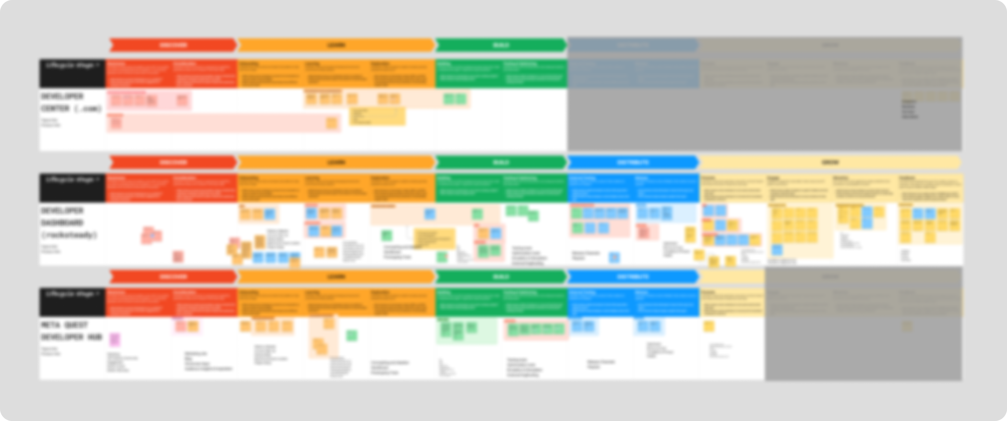
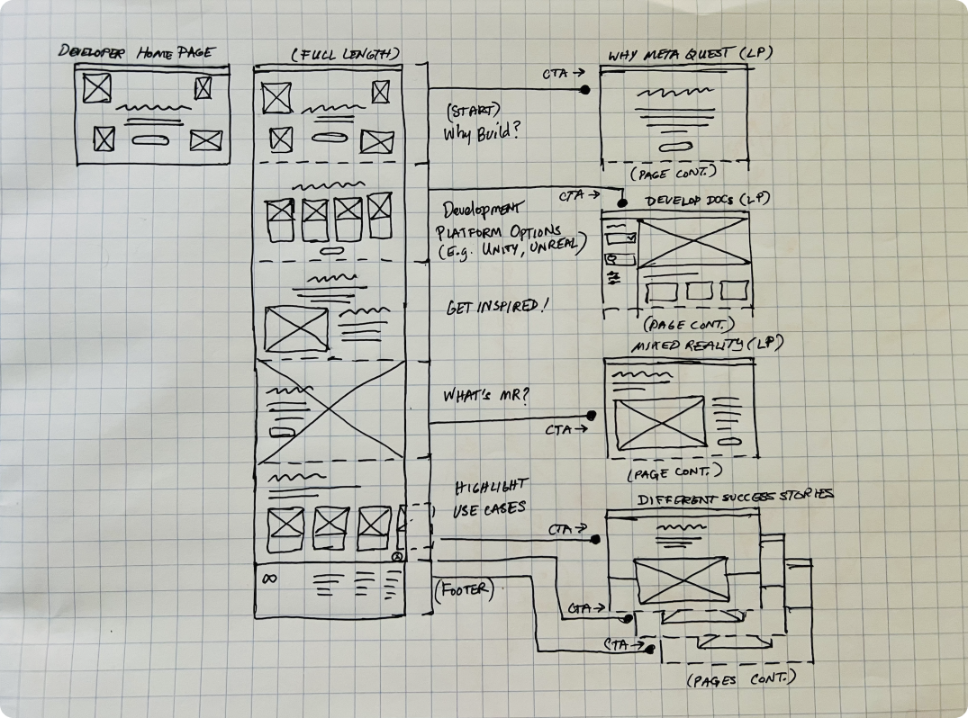
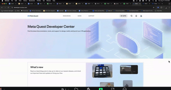
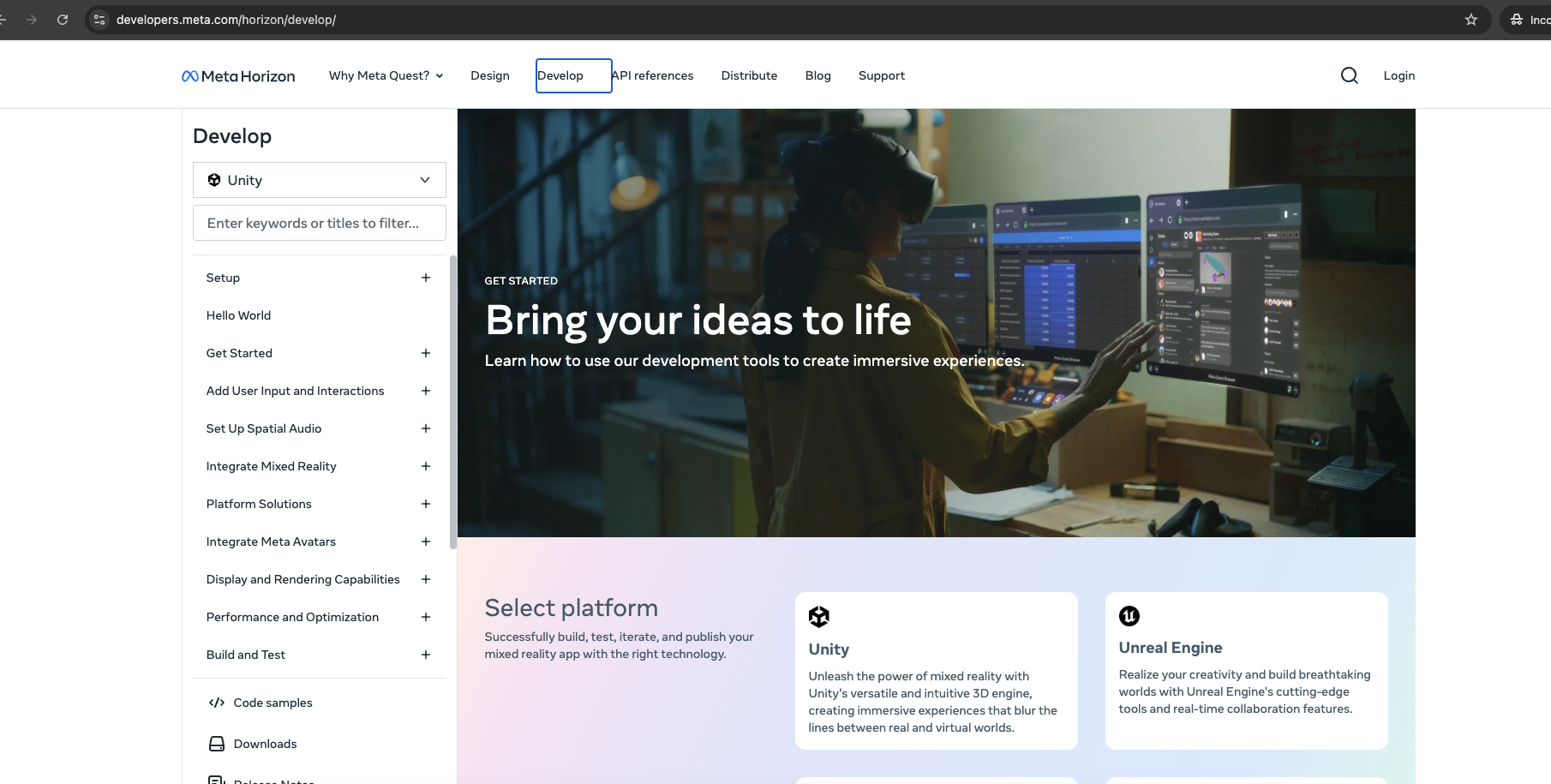
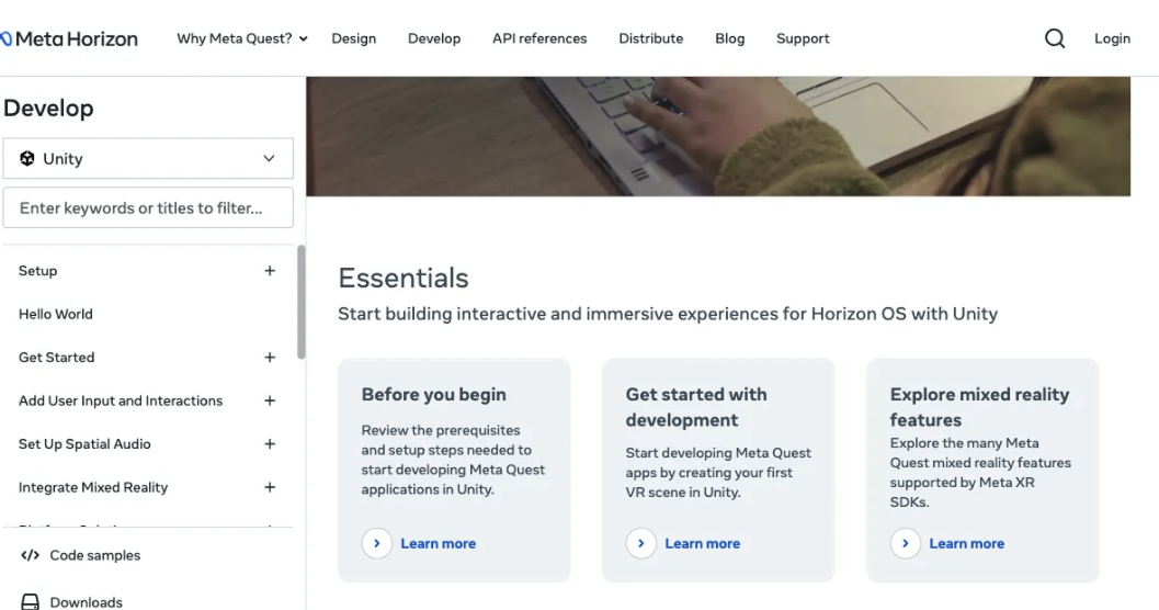
My cross-functional team and I completely restructured the MHDC's information architecture. We moved away from a platform-centric organization (e.g., "Unity," "Unreal Engine") to a task-based organization (e.g., "Why Meta Quest" (Getting Started), "Design," "Develop," "API Reference," "Distribute"). We used card sorting with developers to validate our proposed structure and ensure it aligned with their mental models (Figure 1).
![]()
(Figure 1 - Card sorting exercise to validate the proposed task-based information architecture)
To visualize the new structure, I created a comprehensive information architecture map (Figure 2):
![]()
(Figure 2 - Information architecture map illustrating the new, task-oriented organization of the MHDC)
This map illustrates the new, task-oriented organization of the MHDC. Key areas, such as "Why Meta Quest," "Design (i.e. HIG)," "API Reference," and "Distribute", are clearly defined, providing a logical flow for developers to find the information they need. The map also reveals the depth and breadth of the content, highlighting the significant effort involved in reorganizing and restructuring the entire platform. Notice the clear distinction between high-level categories (like "Design Landing Page" and "Development Landing Page") and the more granular sub-sections, designed for efficient navigation.
My cross-functional team and I completely restructured the MHDC's information architecture. We moved away from a platform-centric organization (e.g., "Unity," "Unreal Engine") to a task-based organization (e.g., "Why Meta Quest" (Getting Started), "Design," "Develop," "API Reference," "Distribute"). We used card sorting with developers to validate our proposed structure and ensure it aligned with their mental models (Figure 1).
(Figure 1 - Card sorting exercise to validate the proposed task-based information architecture)
To visualize the new structure, I created a comprehensive information architecture map (Figure 2):

(Figure 2 - Information architecture map illustrating the new, task-oriented organization of the MHDC)
This map illustrates the new, task-oriented organization of the MHDC. Key areas, such as "Why Meta Quest," "Design (i.e. HIG)," "API Reference," and "Distribute", are clearly defined, providing a logical flow for developers to find the information they need. The map also reveals the depth and breadth of the content, highlighting the significant effort involved in reorganizing and restructuring the entire platform. Notice the clear distinction between high-level categories (like "Design Landing Page" and "Development Landing Page") and the more granular sub-sections, designed for efficient navigation.
WEEK
3-4
3-4
Wireframing and Prototyping
From initial ink sketches on paper to digital refinements in Procreate, I explored a range of design concepts (Figure 1). This iterative sketching process directly fed into my work on low-fidelity wireframes and interactive prototypes in Figma and Framer, where I rapidly iterated on navigation, layout, and interaction. Partnering with the UX Researcher, we conducted quick, iterative usability tests with internal developers and stakeholders—essentially, dogfooding our designs. I also regularly presented design iterations in critiques with product designers from other Horizon OS teams at Meta Reality Labs, incorporating feedback and adjusting designs on the fly.
![]() (Figure 1 - Early wireframe exploration, focusing on navigation and content layout)
(Figure 1 - Early wireframe exploration, focusing on navigation and content layout)
From initial ink sketches on paper to digital refinements in Procreate, I explored a range of design concepts (Figure 1). This iterative sketching process directly fed into my work on low-fidelity wireframes and interactive prototypes in Figma and Framer, where I rapidly iterated on navigation, layout, and interaction. Partnering with the UX Researcher, we conducted quick, iterative usability tests with internal developers and stakeholders—essentially, dogfooding our designs. I also regularly presented design iterations in critiques with product designers from other Horizon OS teams at Meta Reality Labs, incorporating feedback and adjusting designs on the fly.
 (Figure 1 - Early wireframe exploration, focusing on navigation and content layout)
WEEK
5-6
5-6
Visual Design and Branding
I developed a new visual design language for the MHDC, aligning it with the Meta Horizon brand guidelines. I prioritized a clean, modern aesthetic that was both visually appealing and functional. I focused on readability, accessibility, and creating a sense of trust and professionalism.
Early explorations also considered how the MHDC fit within the broader Meta for Developers ecosystem. I experimented with layouts that showcased different categories of developer tools and resources, as seen in this early concept for a "Social Technologies" landing page (Figure 1):
![]()
(Figure 1 - Early design exploration for a 'Social Technologies' landing page, informing visual hierarchy decisions)
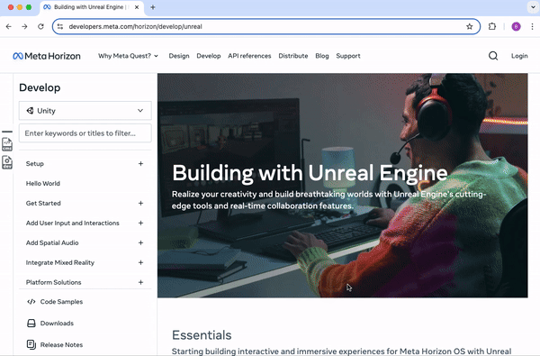
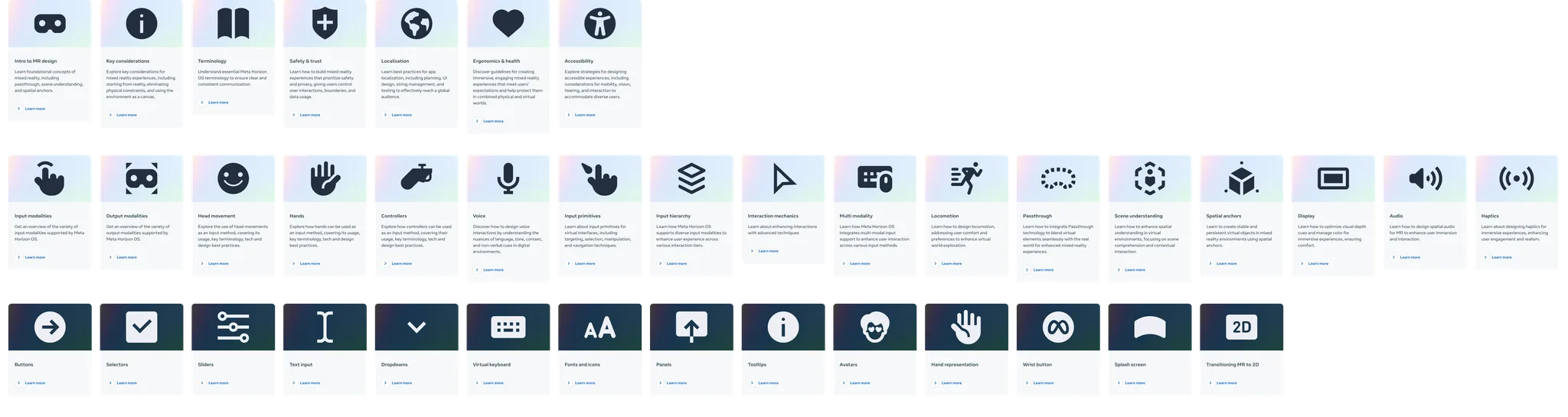
This exploration, while focusing on a broader section of the developer portal, helped solidify my approach to visual hierarchy, card design, and using imagery effectively. However, for the MHDC, the guiding principles of Discoverability and Clarity demanded a more streamlined, information-dense design. Figure 2 demonstrates this shift, contrasting the previous, overly simplified API references page with the new, information-rich, yet balanced Unity documentation API references page. The new design prioritizes quick access to key information without sacrificing visual appeal.
![]()
(Figure 2 - Before and after: Redesign of the Unity documentation API references page, prioritizing discoverability and clarity)
To ensure consistency and scalability, I also developed a comprehensive component library within Figma (Figure 3). This library included reusable UI elements, such as buttons, cards, navigation components, and form elements, each designed to adhere to the Meta Horizon brand guidelines and to be responsive across different screen sizes.
![]()
(Figure 3 - The MHDC component library in Figma, ensuring consistency and scalability)
This component-based approach ensured a consistent visual language across the MHDC. For example, the card component below (Figure 4) is used for Download cards, maintaining its anatomy, states, affordances, and behavior, while incorporating download-specific elements. This approach considered both desktop and mobile web, as seen in the transition from desktop sidesheet to mobile bottom sheet below (Figure 5). Ultimately, it streamlined design and development.
![]()
(Figure 4 - Card component variations, demonstrating different states)
![]()
(Figure 5 - Responsive design of the sheet component, adapting to desktop and mobile viewports)
I developed a new visual design language for the MHDC, aligning it with the Meta Horizon brand guidelines. I prioritized a clean, modern aesthetic that was both visually appealing and functional. I focused on readability, accessibility, and creating a sense of trust and professionalism.
Early explorations also considered how the MHDC fit within the broader Meta for Developers ecosystem. I experimented with layouts that showcased different categories of developer tools and resources, as seen in this early concept for a "Social Technologies" landing page (Figure 1):
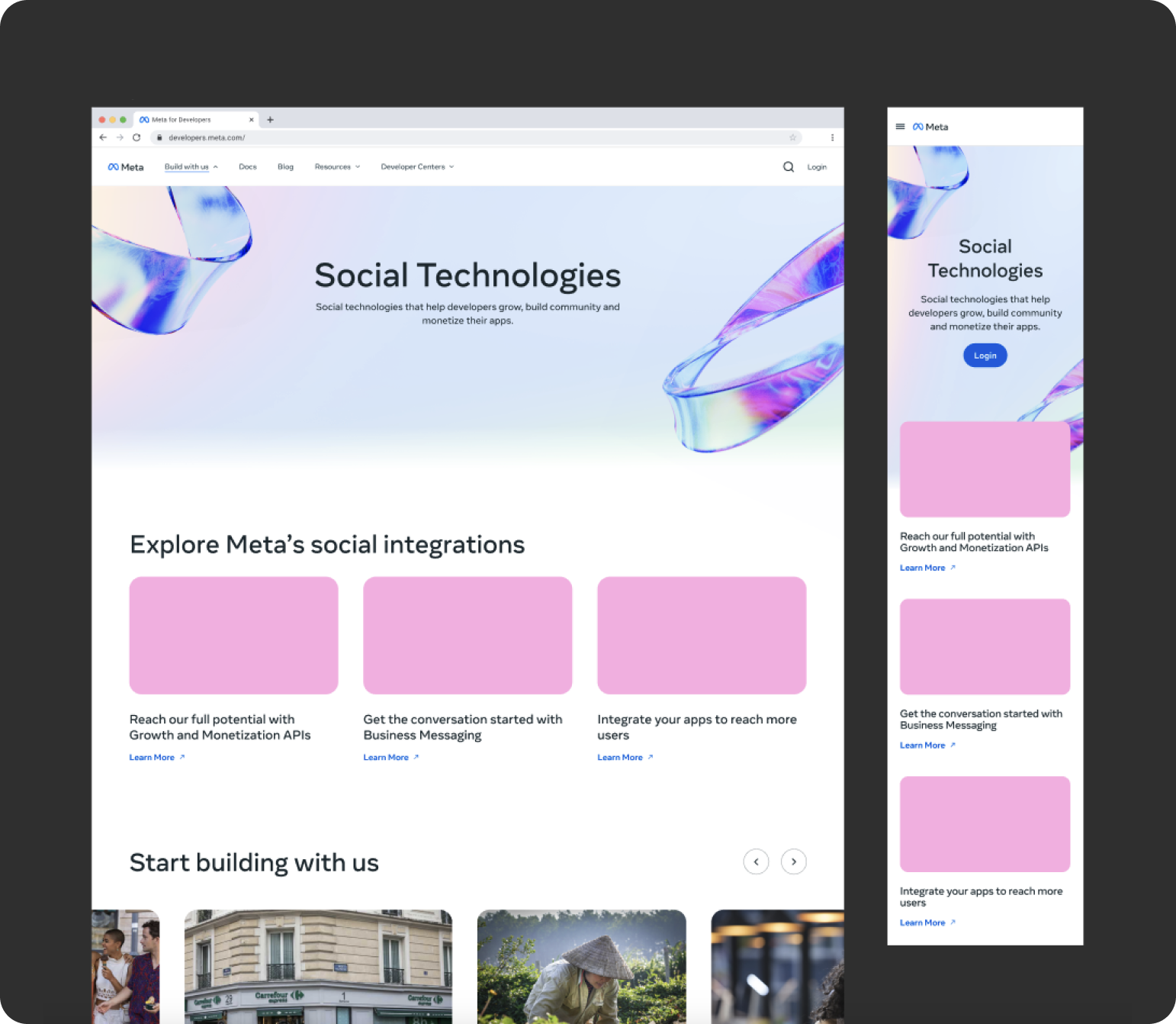
(Figure 1 - Early design exploration for a 'Social Technologies' landing page, informing visual hierarchy decisions)
This exploration, while focusing on a broader section of the developer portal, helped solidify my approach to visual hierarchy, card design, and using imagery effectively. However, for the MHDC, the guiding principles of Discoverability and Clarity demanded a more streamlined, information-dense design. Figure 2 demonstrates this shift, contrasting the previous, overly simplified API references page with the new, information-rich, yet balanced Unity documentation API references page. The new design prioritizes quick access to key information without sacrificing visual appeal.
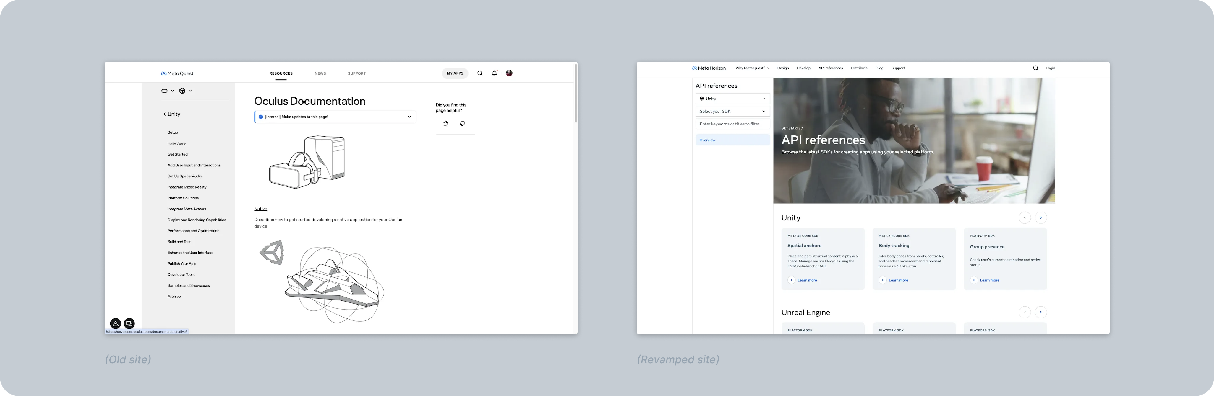
(Figure 2 - Before and after: Redesign of the Unity documentation API references page, prioritizing discoverability and clarity)
To ensure consistency and scalability, I also developed a comprehensive component library within Figma (Figure 3). This library included reusable UI elements, such as buttons, cards, navigation components, and form elements, each designed to adhere to the Meta Horizon brand guidelines and to be responsive across different screen sizes.
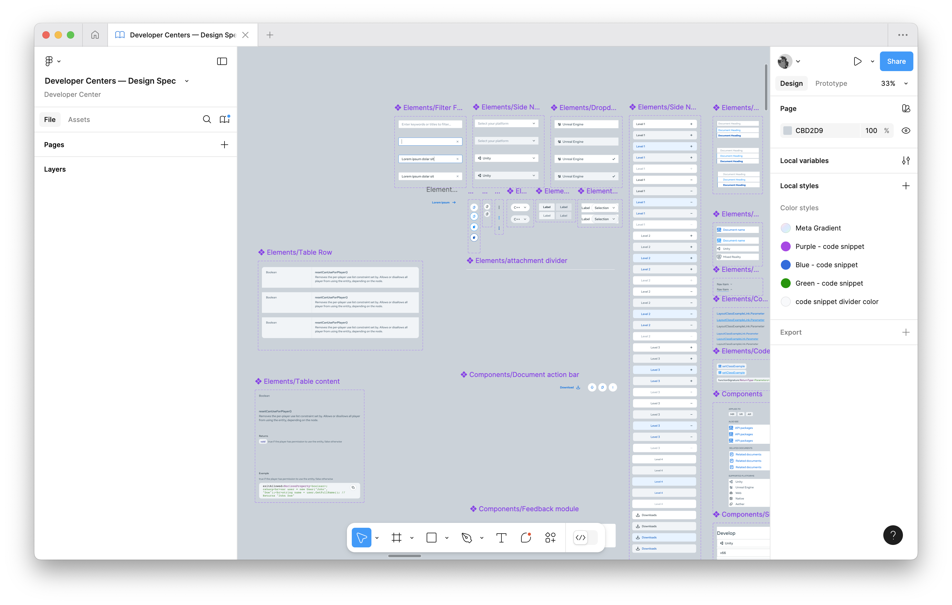
(Figure 3 - The MHDC component library in Figma, ensuring consistency and scalability)
This component-based approach ensured a consistent visual language across the MHDC. For example, the card component below (Figure 4) is used for Download cards, maintaining its anatomy, states, affordances, and behavior, while incorporating download-specific elements. This approach considered both desktop and mobile web, as seen in the transition from desktop sidesheet to mobile bottom sheet below (Figure 5). Ultimately, it streamlined design and development.
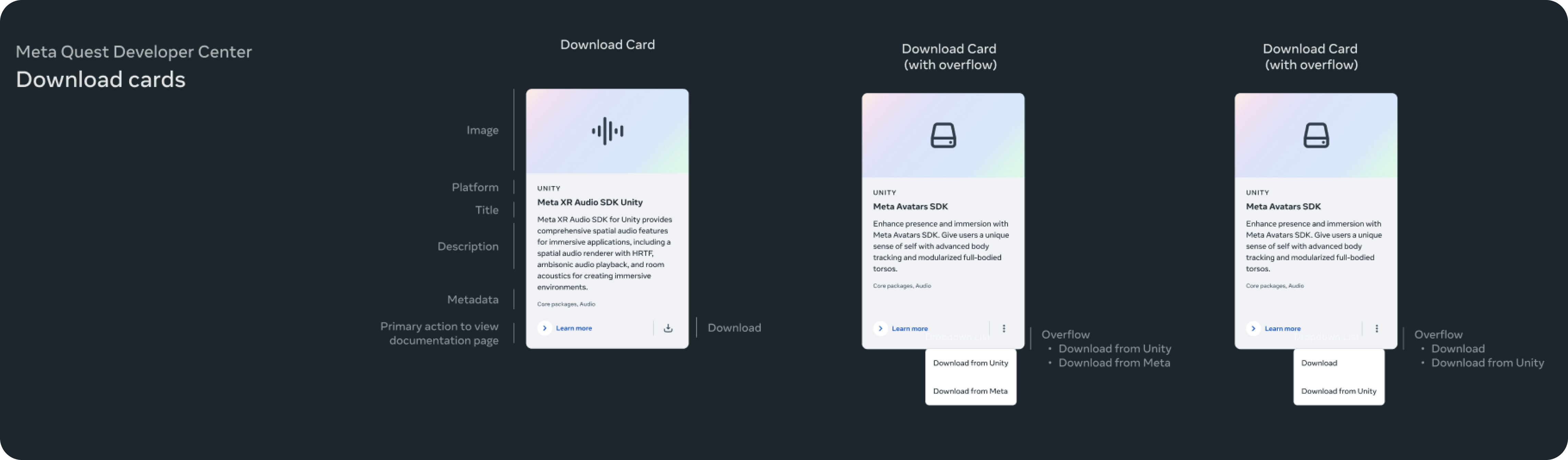
(Figure 4 - Card component variations, demonstrating different states)
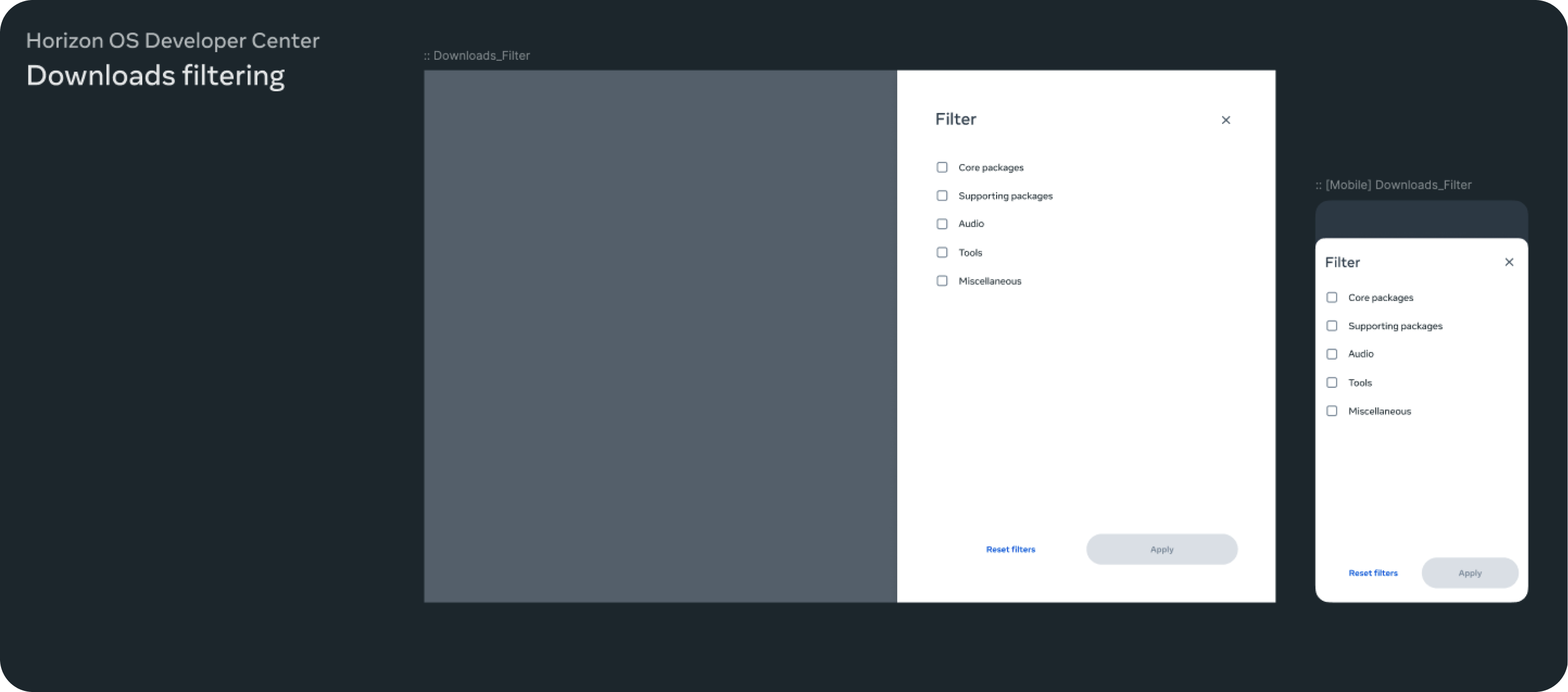
(Figure 5 - Responsive design of the sheet component, adapting to desktop and mobile viewports)
I played a direct role in several key features that significantly improved the developer experience:
Page Feedback Widget
A Beacon of Continuous Improvement
We knew that the journey didn't end with the launch. To ensure continuous improvement and keep our fingers on the pulse of the developer community, I designed and implemented a page feedback widget. This allowed developers to share their thoughts and suggestions directly within the MHDC, creating a direct line of communication between developers and the MHDC team.
This seemingly simple feature had a profound impact. It fostered a sense of community and collaboration, allowing us to continuously iterate and improve the platform based on real-time feedback from the people who mattered most: the developers.
Problem
We needed a way to gather real-time feedback from developers on the quality and usefulness of the documentation.
Solution
I designed and implemented a page feedback widget that allowed developers to easily rate the helpfulness of a page (thumbs up/down) and provide optional text feedback. This created a direct line of communication between developers and the MHDC team.
Process
I explored multiple design iterations, considering different visual styles, interaction patterns, and levels of detail. I collaborated with engineers to ensure feasibility and integration with the existing codebase.
Early explorations of the widget focused on finding a clear and unobtrusive way to integrate the feedback mechanism into the page layout, while also exploring various visual styles and interaction patterns. These images show a couple such explorations:
(Figure 1 - Initial sketch and design for the page feedback widget, exploring various placements and interaction concepts)
![]()
(Figure 2 - Early design exploring the integration of the feedback widget within the page layout)
(Figure 2 - Early design exploring the integration of the feedback widget within the page layout)
Design Iterations and Rationale
The design evolved through several iterations, each refining the user experience and visual integration.
The design evolved through several iterations, each refining the user experience and visual integration.
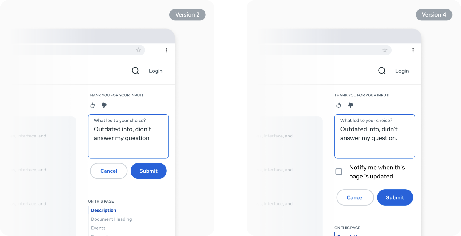
(Version 1) This iteration aligned closely with the MHDC's new branding. The colors and fonts were consistent with other elements in the right rail (such as uppercase section headers), and the thumbs-up/down icons were proportionally sized to the text. A key addition was a dropdown menu appearing after a thumbs-down selection, allowing users to specify the reason for their negative feedback (e.g., "Content not clear," "Outdated information"). This provided more actionable feedback.
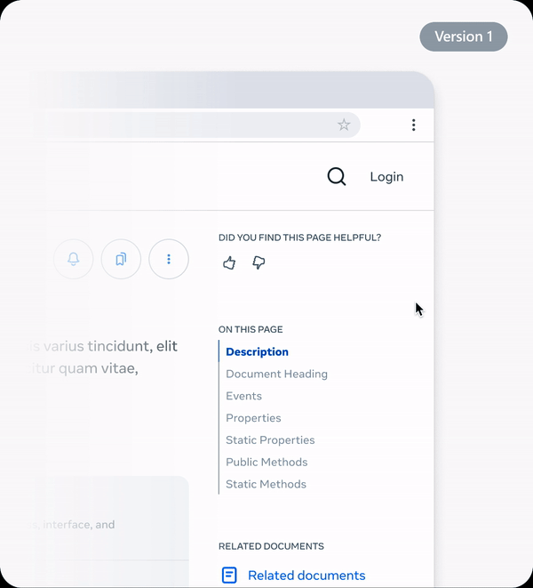
(Figure 3 - Version 1 page feedback widget)
(Version 2) Similar to Version 1, this iteration replaced the dropdown menu with a free-form text field, providing users with more flexibility in their feedback. I considered making this field optional to reduce friction.

(Figure 4 - Version 2 page feedback widget)
(Version 3) This version took a step back towards the legacy feedback feature's design and user experience, primarily to assess user familiarity and preference. However, I updated the thumbs-up/down icon sizes and adjusted the prompt's font size for better visual balance. I also aligned the colors with the right rail's secondary text and icon colors for greater visual consistency.
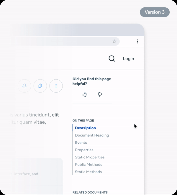
(Figure 5 - Version 3 page feedback widget)
(Version 4) Building upon Version 2, this iteration added a checkbox labeled "Notify me when this page is updated." This feature aimed to close the feedback loop, demonstrating to users that their input directly contributed to improvements and fostering a stronger relationship.
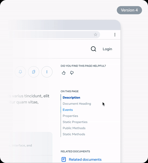
(Figure 6 - Version 4 page feedback widget)
These iterations were presented to the team, and I gathered internal feedback to evaluate the trade-offs of each approach. Considerations included visual consistency, ease of use, the level of detail in the feedback collected, and the potential for future development (e.g., integrating the feedback directly into a task management system).These iterations were presented to the team, gathering feedback on trade-offs involving visual consistency, ease of use, feedback detail, and future development potential (like task management integration).
Phased Rollout Strategy
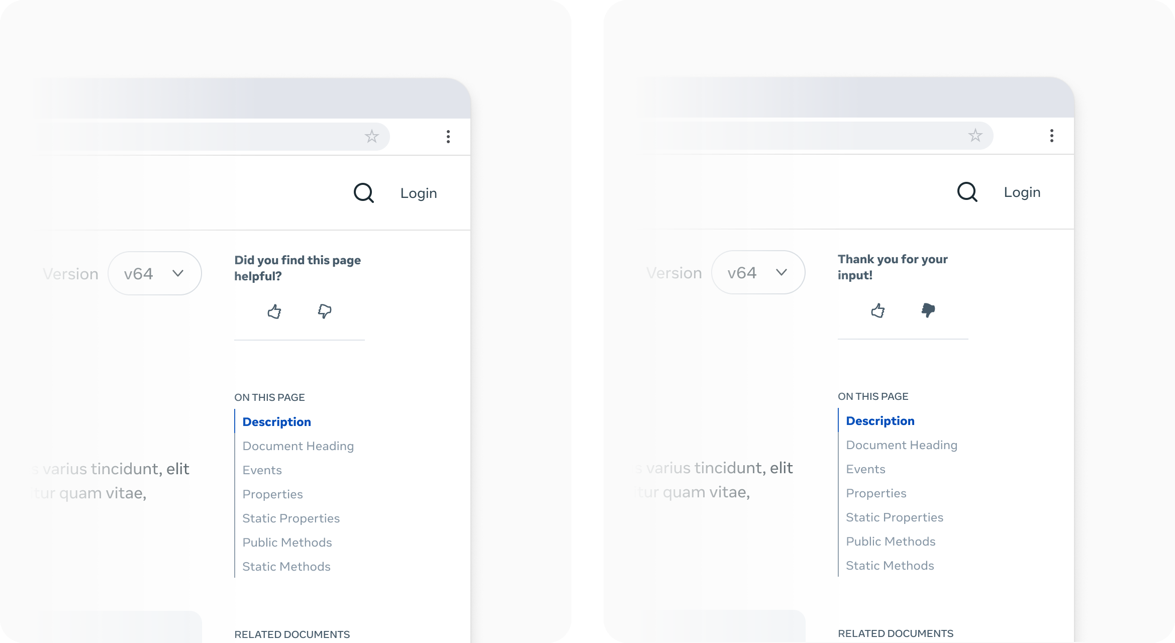
MVP (Connect 2024) -> Version 3 was chosen for launch, balancing familiarity, visual consistency, and minimal development effort for the deadline (Figure 7).
![]() (Figure 7 - Final design of the page feedback widget (Version 3) chosen for the MVP launch)
(Figure 7 - Final design of the page feedback widget (Version 3) chosen for the MVP launch)
Fast Follow -> Post-launch, we planned to transition to Version 2, integrating feedback directly into our internal task management system.
Future Iteration -> Version 4, with a "Notify me" option, was the long-term goal, closing the feedback loop and enabling direct user communication.
![]()
Functional Prototype for Faster Buy-in
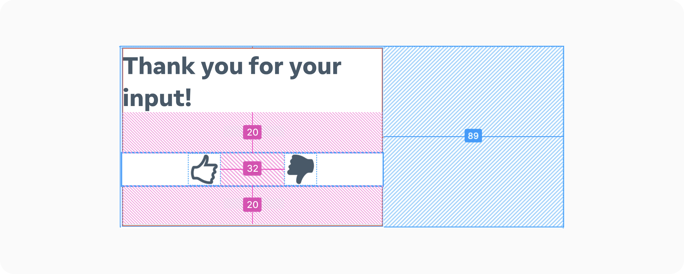
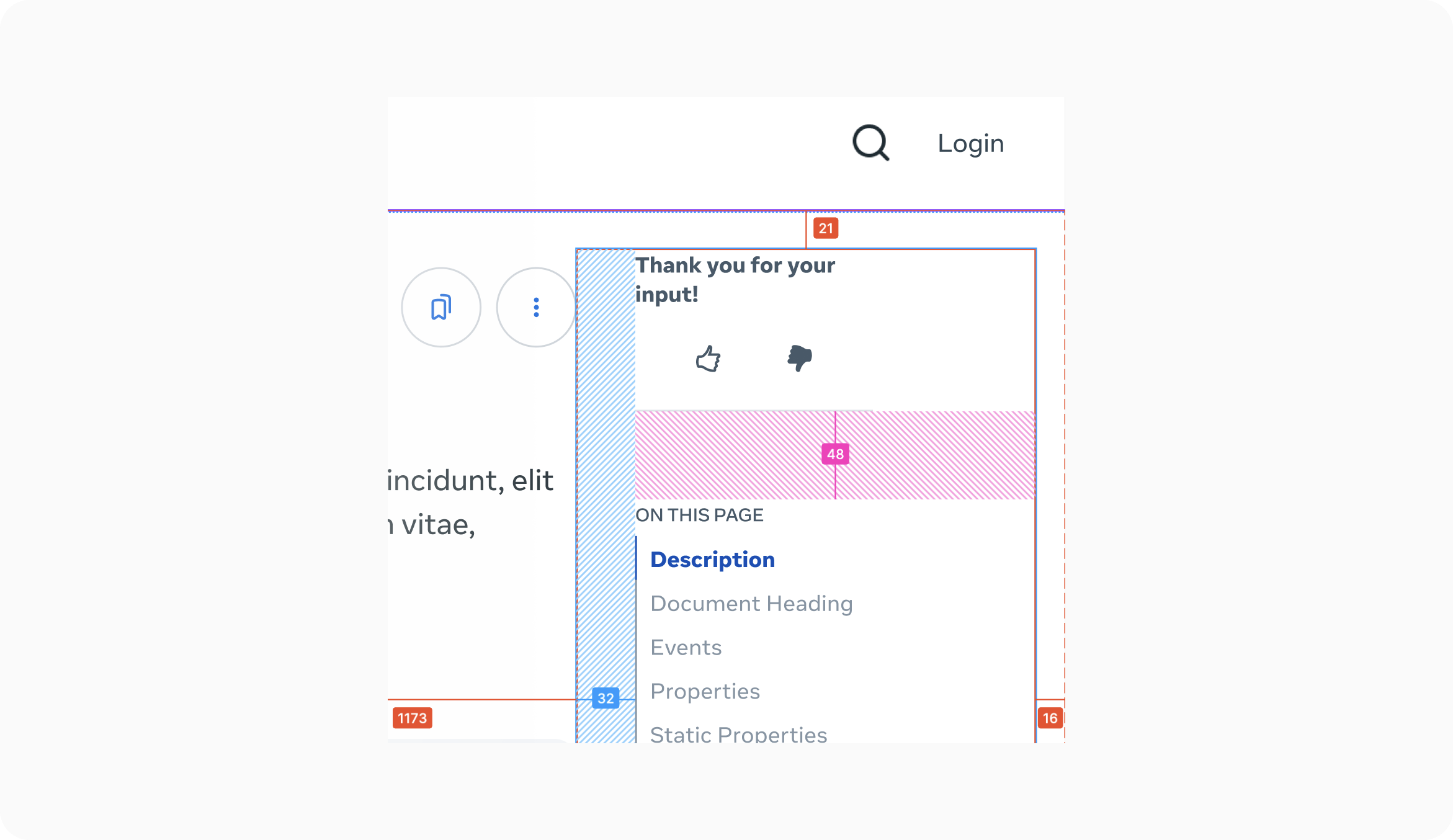
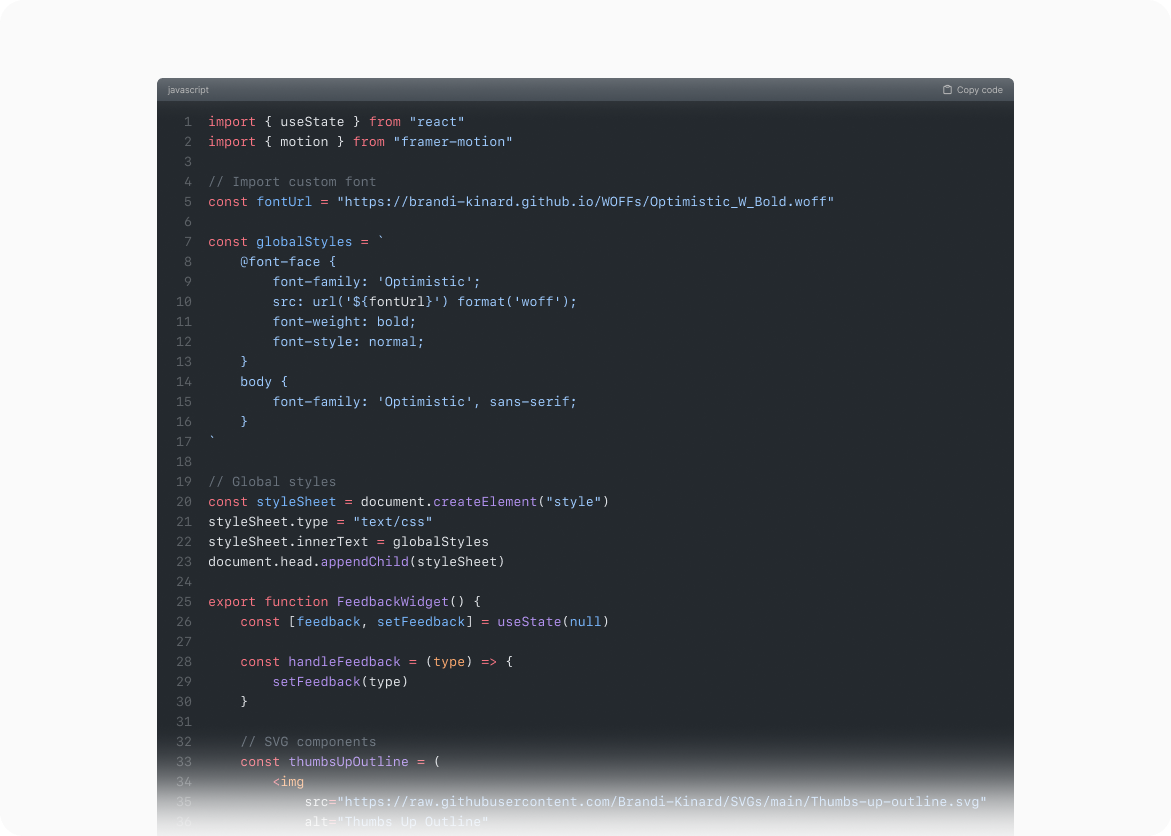
Beyond Figma mockups (Figure 8-9), I built a fully interactive prototype using HTML, CSS, and JavaScript (React/JSX). This accurately replicated the widget's live appearance and behavior, accelerating stakeholder buy-in and providing the engineering team with ready-to-use code and SVG assets, significantly reducing development time (Figure 10).
![]()
(Figure 8 - Feedback widget precise spacing for optimal usability and visual balance)
![]()
(Figure 9 - Placement and spacing of the page feedback widget within the right rail, adhering to the overall page layout)
![]()
(Figure 10 - JavaScript code snippet for the page feedback widget, handling user interaction and data submission)
Try the Prototype
Impact
The feedback widget became a vital source of continuous improvement, allowing us to quickly identify and address issues with the documentation.
Phased Rollout Strategy
MVP (Connect 2024) -> Version 3 was chosen for launch, balancing familiarity, visual consistency, and minimal development effort for the deadline (Figure 7).
 (Figure 7 - Final design of the page feedback widget (Version 3) chosen for the MVP launch)
Fast Follow -> Post-launch, we planned to transition to Version 2, integrating feedback directly into our internal task management system.
Future Iteration -> Version 4, with a "Notify me" option, was the long-term goal, closing the feedback loop and enabling direct user communication.
Functional Prototype for Faster Buy-in
Beyond Figma mockups (Figure 8-9), I built a fully interactive prototype using HTML, CSS, and JavaScript (React/JSX). This accurately replicated the widget's live appearance and behavior, accelerating stakeholder buy-in and providing the engineering team with ready-to-use code and SVG assets, significantly reducing development time (Figure 10).
(Figure 8 - Feedback widget precise spacing for optimal usability and visual balance)
(Figure 9 - Placement and spacing of the page feedback widget within the right rail, adhering to the overall page layout)
(Figure 10 - JavaScript code snippet for the page feedback widget, handling user interaction and data submission)
Try the Prototype
Impact
The feedback widget became a vital source of continuous improvement, allowing us to quickly identify and address issues with the documentation.
Enhanced Login Feature
A Welcoming Gateway
The initial login experience for the MHDC was a critical touchpoint, serving as the first impression for developers. I wanted this initial interaction to be welcoming, intuitive, and aligned with the overall Meta brand experience.
The initial login experience for the MHDC was a critical touchpoint, serving as the first impression for developers. I wanted this initial interaction to be welcoming, intuitive, and aligned with the overall Meta brand experience.
Problem
The existing login process inherited from the old site was clunky and uninviting. It presented a small, contextual menu that lacked visual appeal and didn't effectively communicate the value proposition of the MHDC to potential users. It felt disconnected from the rest of the platform and didn't align with the design patterns used by other Meta web applications (Figure 1-2).
Solution
I redesigned the login and account management experience with a developer-centric approach, focusing on clarity, efficiency, and brand consistency. This involved two key components:
![]() (Figure 1 - Previous login experience using a contextual menu)
(Figure 1 - Previous login experience using a contextual menu)
![]()
(Figure 2 - Previous account management experience, using a contextual menu)
Process
My design process involved close collaboration with the Meta brand identity team to ensure full compliance with Meta's authentication standards and security protocols. I also conducted a competitive analysis of login (Figure 3) and account management (Figure 4) patterns across other Meta web properties, including Meta Store, to identify best practices and ensure a cohesive user experience. This research informed my decision to move away from the existing contextual menus.
![]() (Figure 3 - Meta Store's login pattern, using a side sheet (competitive analysis of login patterns from various resources))
(Figure 3 - Meta Store's login pattern, using a side sheet (competitive analysis of login patterns from various resources))
![]()
(Figure 4 - Meta Store's account management pattern, using a top-nav dropdown (competitive analysis of post-login account management patterns))
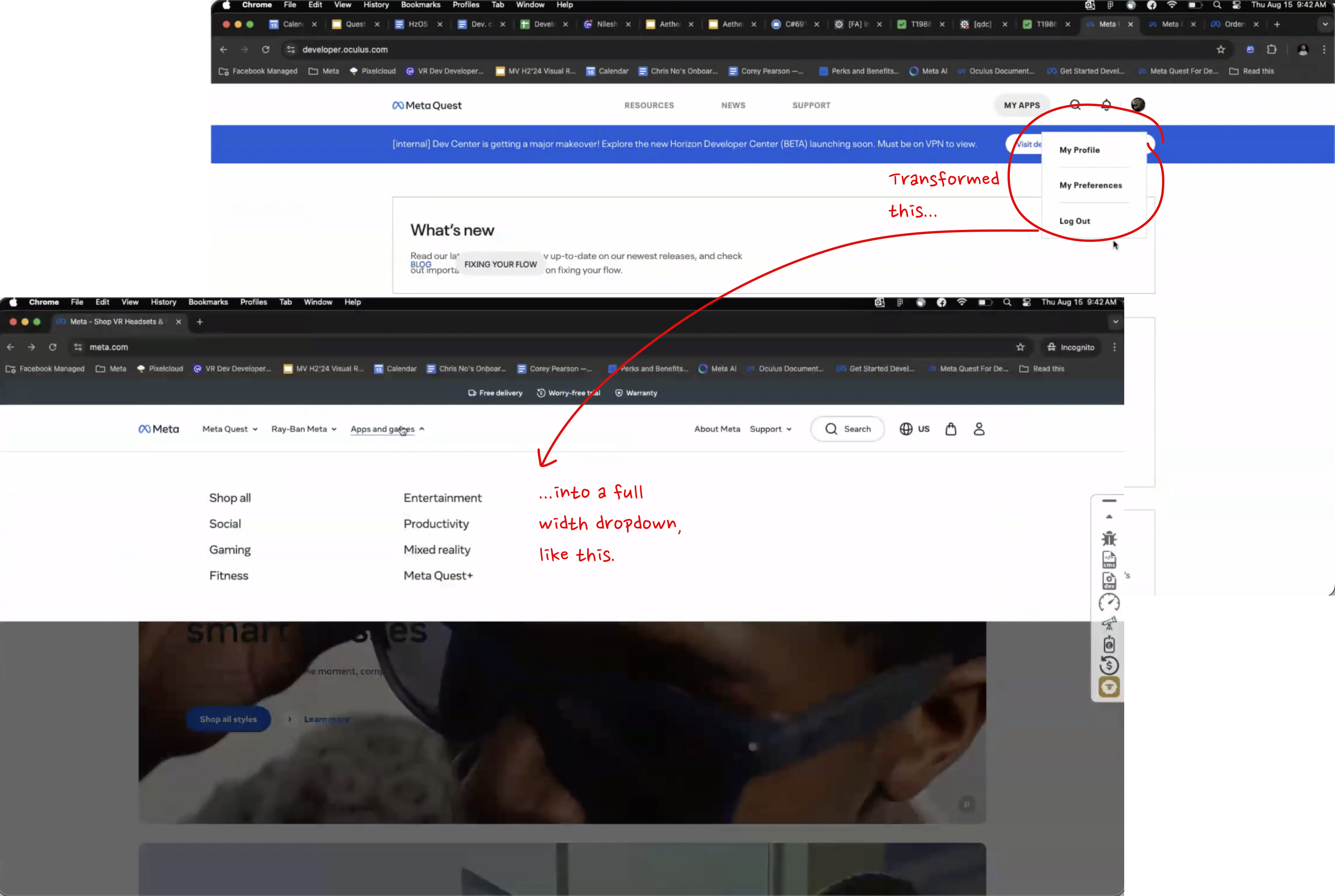
The existing login process inherited from the old site was clunky and uninviting. It presented a small, contextual menu that lacked visual appeal and didn't effectively communicate the value proposition of the MHDC to potential users. It felt disconnected from the rest of the platform and didn't align with the design patterns used by other Meta web applications (Figure 1-2).
Solution
I redesigned the login and account management experience with a developer-centric approach, focusing on clarity, efficiency, and brand consistency. This involved two key components:
- Pre-Authentication (Login)
A redesigned login flow utilizing a sidesheet that slides in from the right, providing ample space to highlight key platform benefits and create a more welcoming initial interaction.
- Post-Authentication (Account Management)
A full-width dropdown menu, triggered by clicking the user's avatar, providing clear access to account settings and a prominent "Log Out" option. This dropdown also included standard navigation links, ensuring consistent access to key areas of the MHDC regardless of login state.
 (Figure 1 - Previous login experience using a contextual menu)
(Figure 2 - Previous account management experience, using a contextual menu)
Process
My design process involved close collaboration with the Meta brand identity team to ensure full compliance with Meta's authentication standards and security protocols. I also conducted a competitive analysis of login (Figure 3) and account management (Figure 4) patterns across other Meta web properties, including Meta Store, to identify best practices and ensure a cohesive user experience. This research informed my decision to move away from the existing contextual menus.
 (Figure 3 - Meta Store's login pattern, using a side sheet (competitive analysis of login patterns from various resources))
(Figure 4 - Meta Store's account management pattern, using a top-nav dropdown (competitive analysis of post-login account management patterns))
Design Iterations and Rationale
The design evolved through several key iterations, driven by internal reviews:
The design evolved through several key iterations, driven by internal reviews:
Shift to Sidesheet (Pre-Login)
Recognizing the limitations of the contextual menu for pre-authentication, I proposed a sidesheet approach (Figure 5). This provided more space for a visually engaging login experience, allowing for the potential inclusion of key value propositions, an idea I briefly explored with Content Designers (Figure 6). This sidesheet design also aligned with the design pattern used by Meta Store, promoting consistency across Meta's web properties. Ultimately, we prioritized a streamlined login for the MVP, focusing on the core functionality.
Recognizing the limitations of the contextual menu for pre-authentication, I proposed a sidesheet approach (Figure 5). This provided more space for a visually engaging login experience, allowing for the potential inclusion of key value propositions, an idea I briefly explored with Content Designers (Figure 6). This sidesheet design also aligned with the design pattern used by Meta Store, promoting consistency across Meta's web properties. Ultimately, we prioritized a streamlined login for the MVP, focusing on the core functionality.
 (Figure 5 - Comparison of login patterns: Meta Store (front) and the previous MHDC (back))
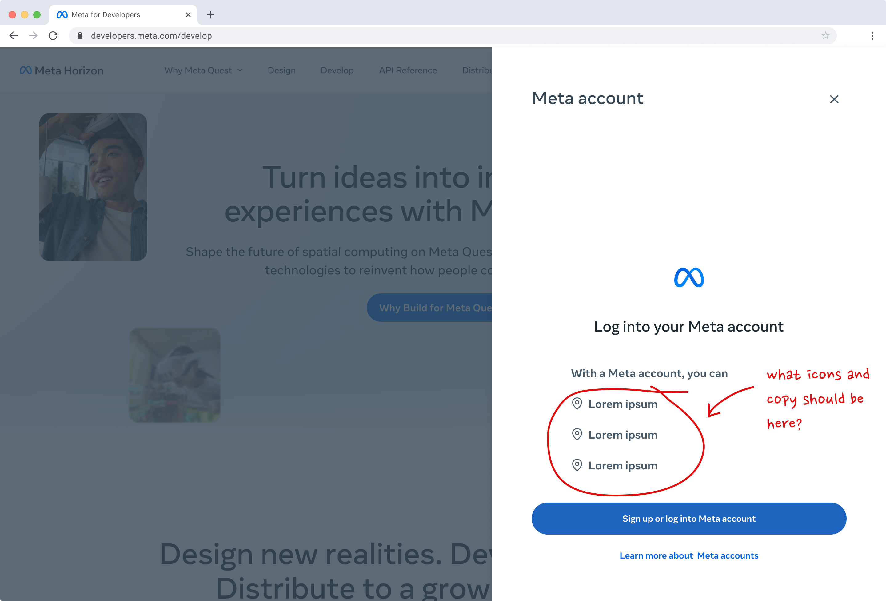
(Figure 6 - Early design exploration for the login redesign, with annotations and feedback (proposed login sidesheet design, offering space for value proposition messaging (later deferred for MVP))
Full-Width Dropdown (Post-Login)
For post-authentication, I initially explored expanding the contextual menu. However, to maintain consistency with the broader Meta ecosystem (specifically, the Meta Store implementation) and provide a more scalable solution, I transitioned to a full-width dropdown menu (Figure 7-8) activated by the user's avatar. This provided clear, consistent access to account management options and other key navigation links.
For post-authentication, I initially explored expanding the contextual menu. However, to maintain consistency with the broader Meta ecosystem (specifically, the Meta Store implementation) and provide a more scalable solution, I transitioned to a full-width dropdown menu (Figure 7-8) activated by the user's avatar. This provided clear, consistent access to account management options and other key navigation links.
 (Figure 7 - Comparison of account management patterns: Meta Store (front) and the previous MHDC (back))
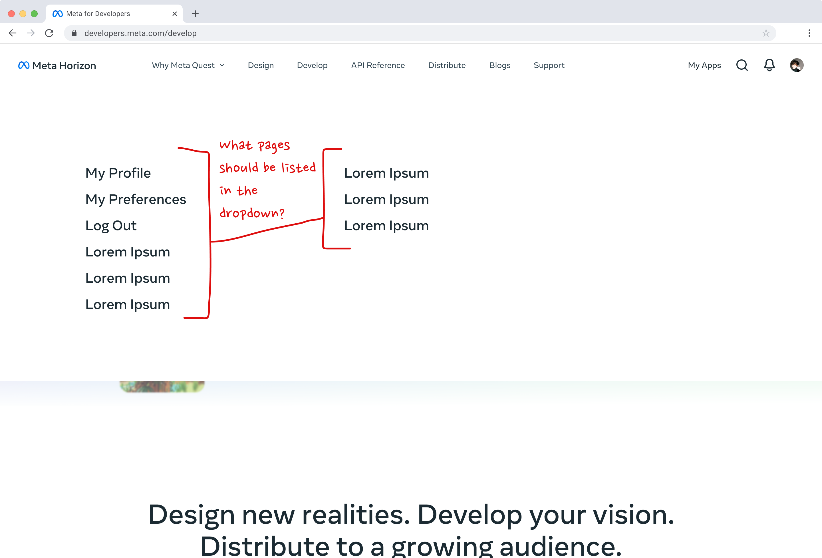
(Figure 8 - Design exploration for the account management redesign, including annotations (proposed full-width dropdown design for account management, promoting consistency with Meta's design system))
MVP and Future Iterations
Due to time constraints and the need to prioritize core functionality for the Meta Connect 2024 launch, we decided to initially omit the value proposition messaging within the login sidesheet. This messaging was planned for a future iteration. The core login functionality (Figure 9) and account management dropdown (Figure 10) were prioritized for the MVP.
Due to time constraints and the need to prioritize core functionality for the Meta Connect 2024 launch, we decided to initially omit the value proposition messaging within the login sidesheet. This messaging was planned for a future iteration. The core login functionality (Figure 9) and account management dropdown (Figure 10) were prioritized for the MVP.
 (Figure 9 - Final MVP design for the login experience, focusing on core functionality)
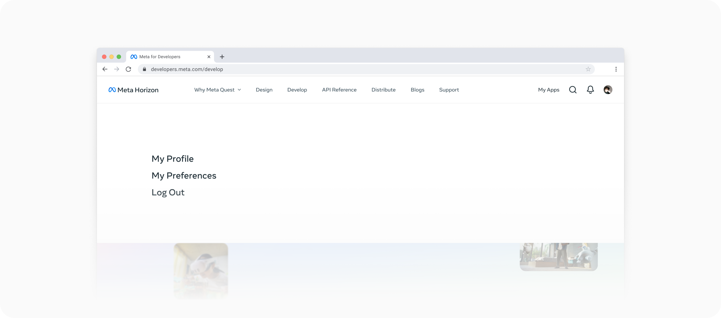
(Figure 10 - Final MVP design of the account management dropdown, providing clear access to key options)
I also created prototypes to demonstrate these interactive states (Figure 11-12).
![]()
(Figure 11 - Interactive prototype demonstrating the login sidesheet animation)
![]()
(Figure 12 - Interactive prototype demonstrating the full-width account management dropdown)
Impact
The redesigned login and account management experience created a significantly more welcoming and intuitive entry point to the MHDC. By aligning with established Meta design patterns, I improved usability and fostered a sense of familiarity for developers already using other Meta products. The phased approach allowed me to deliver a functional and visually appealing solution for the launch, while laying the groundwork for future enhancements.
(Figure 11 - Interactive prototype demonstrating the login sidesheet animation)
(Figure 12 - Interactive prototype demonstrating the full-width account management dropdown)
Impact
The redesigned login and account management experience created a significantly more welcoming and intuitive entry point to the MHDC. By aligning with established Meta design patterns, I improved usability and fostered a sense of familiarity for developers already using other Meta products. The phased approach allowed me to deliver a functional and visually appealing solution for the launch, while laying the groundwork for future enhancements.
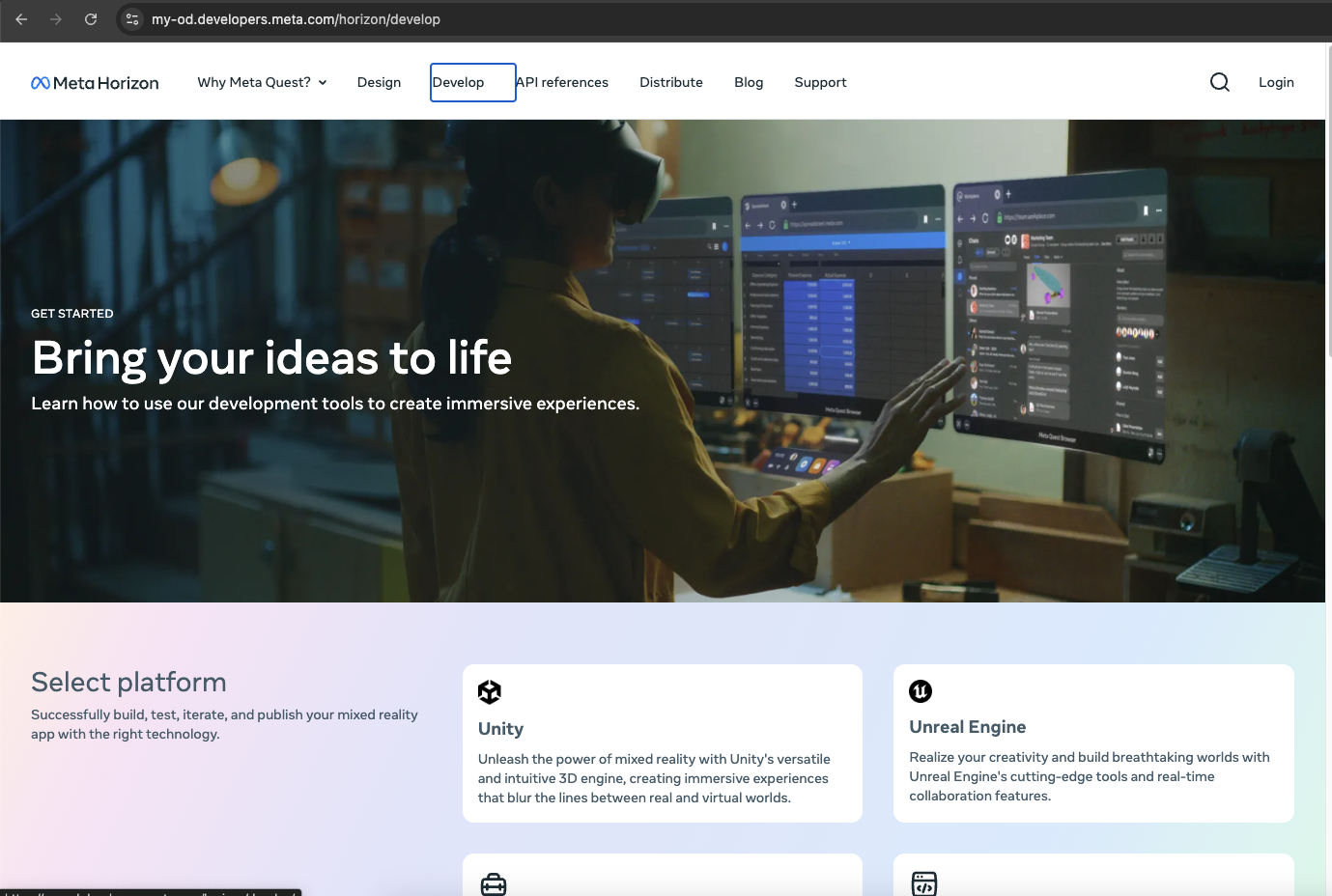
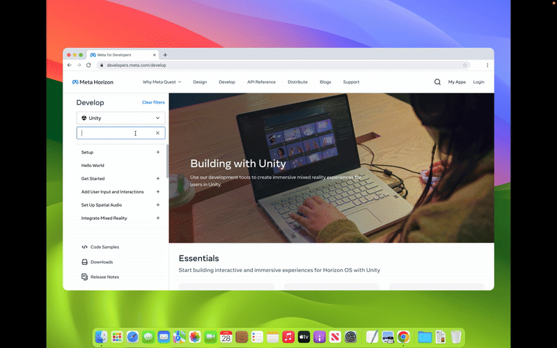
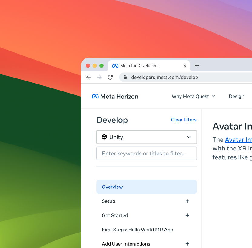
Platform Selection Design
Guiding Developers to the Right Path
A seemingly small, but critical, aspect of the MHDC redesign was ensuring that developers could easily find content relevant to their chosen development platform (e.g., Unity, Unreal Engine, Native). An intuitive and unbiased platform selection experience was crucial for both new and existing users.
A seemingly small, but critical, aspect of the MHDC redesign was ensuring that developers could easily find content relevant to their chosen development platform (e.g., Unity, Unreal Engine, Native). An intuitive and unbiased platform selection experience was crucial for both new and existing users.
Problem
The initial engineering proposal involved a gating side navigation bar that defaulted to Unity for all logged-out users accessing the `/develop` and `/documentation` sections. This approach presented several significant problems:
![]()
(Figure 1 - Initial engineering proposal with a default Unity side navigation, creating platform bias)
Solution
To address these issues, I proposed and rapidly prototyped a "progressive reveal" approach:
Process
Recognizing the potential impact of this design decision, I moved quickly to develop a working prototype within an hour. This rapid prototyping approach allowed me to visualize the solution and communicate its benefits to the team effectively. I then collaborated closely with engineers and the technical documentation manager to gather feedback and iterate on the design.
The initial engineering proposal involved a gating side navigation bar that defaulted to Unity for all logged-out users accessing the `/develop` and `/documentation` sections. This approach presented several significant problems:
Platform bias.
It implicitly favored Unity developers, potentially alienating or confusing developers using other platforms.
Information overload.
For new users unfamiliar with the different platform options, the side navigation, combined with the default Unity content, could be overwhelming and create a poor first impression.
Unnecessary friction.
It forced users who weren't interested in Unity to navigate away from the default, adding unnecessary steps to their workflow.
(Figure 1 - Initial engineering proposal with a default Unity side navigation, creating platform bias)
Solution
To address these issues, I proposed and rapidly prototyped a "progressive reveal" approach:
Logged-in users with preferences.
Users who had previously set a platform preference would be taken directly to their platform-specific content, streamlining their experience.
New or logged-out users.
Users without a saved preference would encounter a clean, introductory landing page that clearly presented the available platform options (Unity, Unreal Engine, Native, etc.), allowing them to make an informed choice.
Removed side navigation.
For new or logged-out user, I removed the side navigation to have them focus on the platform options.
Process
Recognizing the potential impact of this design decision, I moved quickly to develop a working prototype within an hour. This rapid prototyping approach allowed me to visualize the solution and communicate its benefits to the team effectively. I then collaborated closely with engineers and the technical documentation manager to gather feedback and iterate on the design.
Design Iterations and Rationale
The platform selection design evolved through several key iterations:
The platform selection design evolved through several key iterations:
Initial Prototype (Side Navigation Removal)
My first prototype focused on removing the gating side navigation for users without a platform preference, immediately addressing the information overload and platform bias issues (Figure 2).
My first prototype focused on removing the gating side navigation for users without a platform preference, immediately addressing the information overload and platform bias issues (Figure 2).
Landing Page Design
I designed a clean and intuitive landing page for new/logged-out users, clearly presenting the platform options with brief descriptions and relevant icons (Figure 3).
Platform Preference Management (Logged-in Users)
Based on feedback from the engineering team, I designed a mechanism for logged-in users to easily change their platform preference. This involved a simple, intuitive interface within the user's account settings. I explored a "Back" vs "Clear Filter" for the user.
 (Figure 2 - Initial mockup focusing on removing the side navigation to create a cleaner user flow)
(Figure 3 - Redesigned landing page for new/logged-out users, offering clear platform choices)
“Back” vs. “Clear Filters” CTA
I opted for a "Back" button (Figure 5) instead of "Clear Filters" (Figure 4) for the platform selection, believing it would be more intuitively understandable for users navigating back to the platform selection.
I opted for a "Back" button (Figure 5) instead of "Clear Filters" (Figure 4) for the platform selection, believing it would be more intuitively understandable for users navigating back to the platform selection.
Platform Comparison (Proposed)
The technical documentation manager suggested adding a comparison table to the landing page, highlighting the key differences between the platforms to further aid decision-making. While this was a valuable suggestion, it was deferred for a later iteration due to time constraints.
 (Figure 4 - Prototype exploring a 'Clear Filters' option for platform preference management)
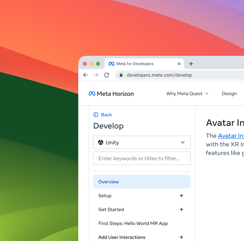 (Figure 5 - Prototype demonstrating the 'Back' button for intuitive navigation)
(Figure 6 - Final implemented solution for platform selection, ensuring a user-friendly experience)
Final Solution
I made sure the engineers implemented the final product bug-free and according to the design spec.
Impact
This rapid prototyping and collaborative approach resulted in a significantly improved platform selection experience. By removing the initial bias towards Unity and providing a clear, intuitive pathway for platform selection, we created a more welcoming and user-friendly experience for all developers, regardless of their platform choice. This seemingly small change had a significant positive impact on discoverability and user satisfaction, while also maintaining development feasibility.
Content Integration Crisis and Resolution
As we approached the final weeks before the Meta Connect 2024 launch, a critical bottleneck emerged: content readiness. The original project plan relied on numerous Content Designers, Technical Documentation Engineers, and Marketing POCs to provide the final images, videos, code snippets, links, and text for all the site's pages. However, progress was significantly behind schedule, and the assigned Project Manager was overwhelmed, struggling to track down missing assets and coordinate across the various teams. This posed a serious risk to our launch timeline.
Recognizing the urgency of the situation, I stepped in to take on additional project management responsibilities, even though it wasn't formally part of my role as a UX/UI Designer. My goal was to untangle the complex web of dependencies and ensure that all necessary content was delivered in time for the engineers to complete the site's implementation.
My approach involved the following:
![]()
(Figure 7 - Content asset tracking spreadsheet, ensuring all materials were delivered before launch)
This intense, focused effort, while demanding, proved highly effective. Despite some initial doubts and a few stragglers, all critical content assets were delivered in time for the engineers to complete the site's implementation before the Meta Connect 2024 deadline. This experience highlighted the importance of proactive communication, clear accountability, and a willingness to go above and beyond to ensure project success.
As we approached the final weeks before the Meta Connect 2024 launch, a critical bottleneck emerged: content readiness. The original project plan relied on numerous Content Designers, Technical Documentation Engineers, and Marketing POCs to provide the final images, videos, code snippets, links, and text for all the site's pages. However, progress was significantly behind schedule, and the assigned Project Manager was overwhelmed, struggling to track down missing assets and coordinate across the various teams. This posed a serious risk to our launch timeline.
Recognizing the urgency of the situation, I stepped in to take on additional project management responsibilities, even though it wasn't formally part of my role as a UX/UI Designer. My goal was to untangle the complex web of dependencies and ensure that all necessary content was delivered in time for the engineers to complete the site's implementation.
My approach involved the following:
-
Creating a living progress tracker.
I developed a detailed spreadsheet (Figure 7) to track the status of every content asset for every page of the MHDC. This spreadsheet included columns for the page name, draft, assigned POC, status (e.g., "On Track," "Blocked," "Ready for Review," "Under Review," "Completed"), due date, and any relevant notes. This provided a single source of truth for the entire team.
-
Establishing a cross-functional collaboration.
I created a dedicated communication channel, a shared Google Doc, where the Content Designers, Technical Documentation Engineers, and Marketing POCs could communicate with me directly, ask questions, and provide updates. This fostered real-time collaboration and issue resolution.
-
Direct outreach and accountability.
I proactively contacted each POC, often multiple times, to clarify requirements, identify roadblocks, and ensure they understood the urgency of their tasks. I documented their commitments and held them accountable for delivering their assigned content on time. This involved a significant amount of "nagging," but it was necessary to drive progress.
-
Untangling dependencies.
I worked closely with the PM to identify and resolve any dependencies between different content assets or teams. This often involved tracking down the correct POC for a particular asset, as the initial assignments were sometimes unclear or outdated.
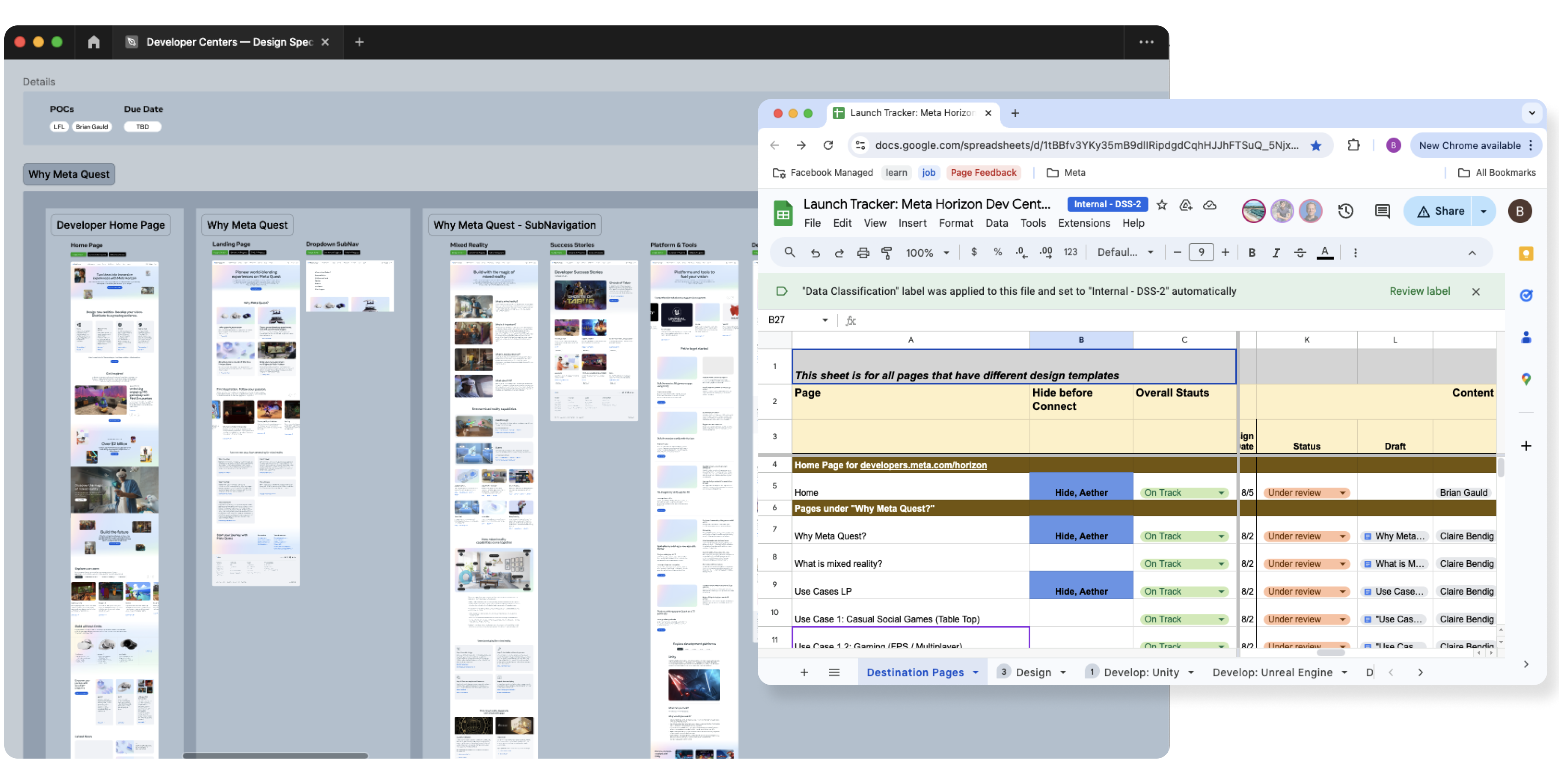
(Figure 7 - Content asset tracking spreadsheet, ensuring all materials were delivered before launch)
This intense, focused effort, while demanding, proved highly effective. Despite some initial doubts and a few stragglers, all critical content assets were delivered in time for the engineers to complete the site's implementation before the Meta Connect 2024 deadline. This experience highlighted the importance of proactive communication, clear accountability, and a willingness to go above and beyond to ensure project success.
WEEK
7-8
7-8
Implementation, Refinement, and the Devil in the Details
The final two weeks were a whirlwind of activity, transitioning from design to a fully functional, live platform. While I worked closely with the engineering team to implement the new design and address any remaining bugs or performance issues, my role extended far beyond traditional design responsibilities. I became a craftsman, meticulously refining every detail of the MHDC to ensure a polished and seamless experience for developers.
This involved diving directly into the codebase (production code) – the CMS (Content Management System) used by engineers to develop MHDC – using primarily the React (JavaScript library) framework. I wasn't just handing off designs; I was actively involved in ensuring their accurate and effective implementation. This proactive approach allowed me to identify and resolve issues that might have otherwise been missed or delayed, directly contributing to a smoother launch.
My Hands-On Approach to Front-End Engineering and Bug Fixes
My engineering background proved invaluable during this phase. I was able to assist the engineering team with last-minute changes to the site structure, accommodate urgent content updates, and, crucially, squash bugs that threatened the user experience. Here are some specific examples of my front-end contributions:
The final two weeks were a whirlwind of activity, transitioning from design to a fully functional, live platform. While I worked closely with the engineering team to implement the new design and address any remaining bugs or performance issues, my role extended far beyond traditional design responsibilities. I became a craftsman, meticulously refining every detail of the MHDC to ensure a polished and seamless experience for developers.
This involved diving directly into the codebase (production code) – the CMS (Content Management System) used by engineers to develop MHDC – using primarily the React (JavaScript library) framework. I wasn't just handing off designs; I was actively involved in ensuring their accurate and effective implementation. This proactive approach allowed me to identify and resolve issues that might have otherwise been missed or delayed, directly contributing to a smoother launch.
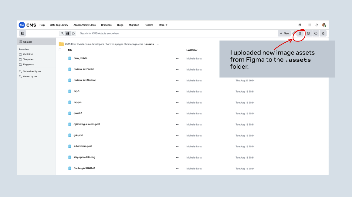
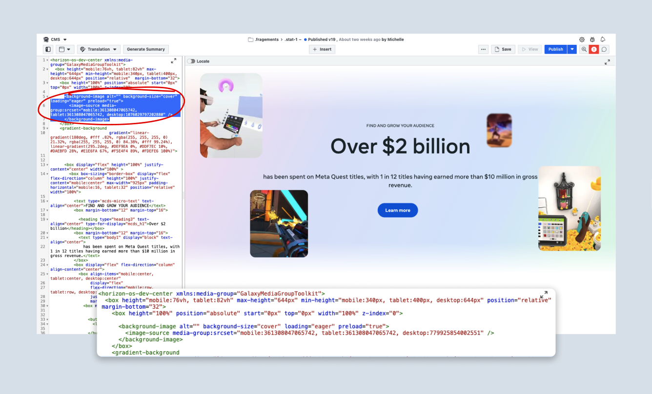
The carousel below provides a glimpse into my typical QA process, demonstrating how I meticulously compared the live site against the Figma design specs and swiftly addressed any discrepancies, as shown in the example involving missing image assets on the homepage.
![]()
![]()
![]()
![]()
(Figure 1 - QA process: Identifying and addressing discrepancies between the live site and the Figma design specifications.)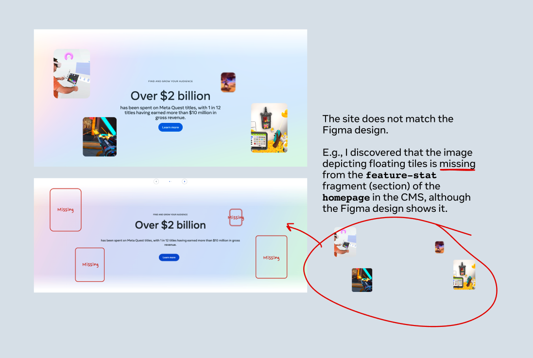

My Hands-On Approach to Front-End Engineering and Bug Fixes
My engineering background proved invaluable during this phase. I was able to assist the engineering team with last-minute changes to the site structure, accommodate urgent content updates, and, crucially, squash bugs that threatened the user experience. Here are some specific examples of my front-end contributions:
Learn More Links
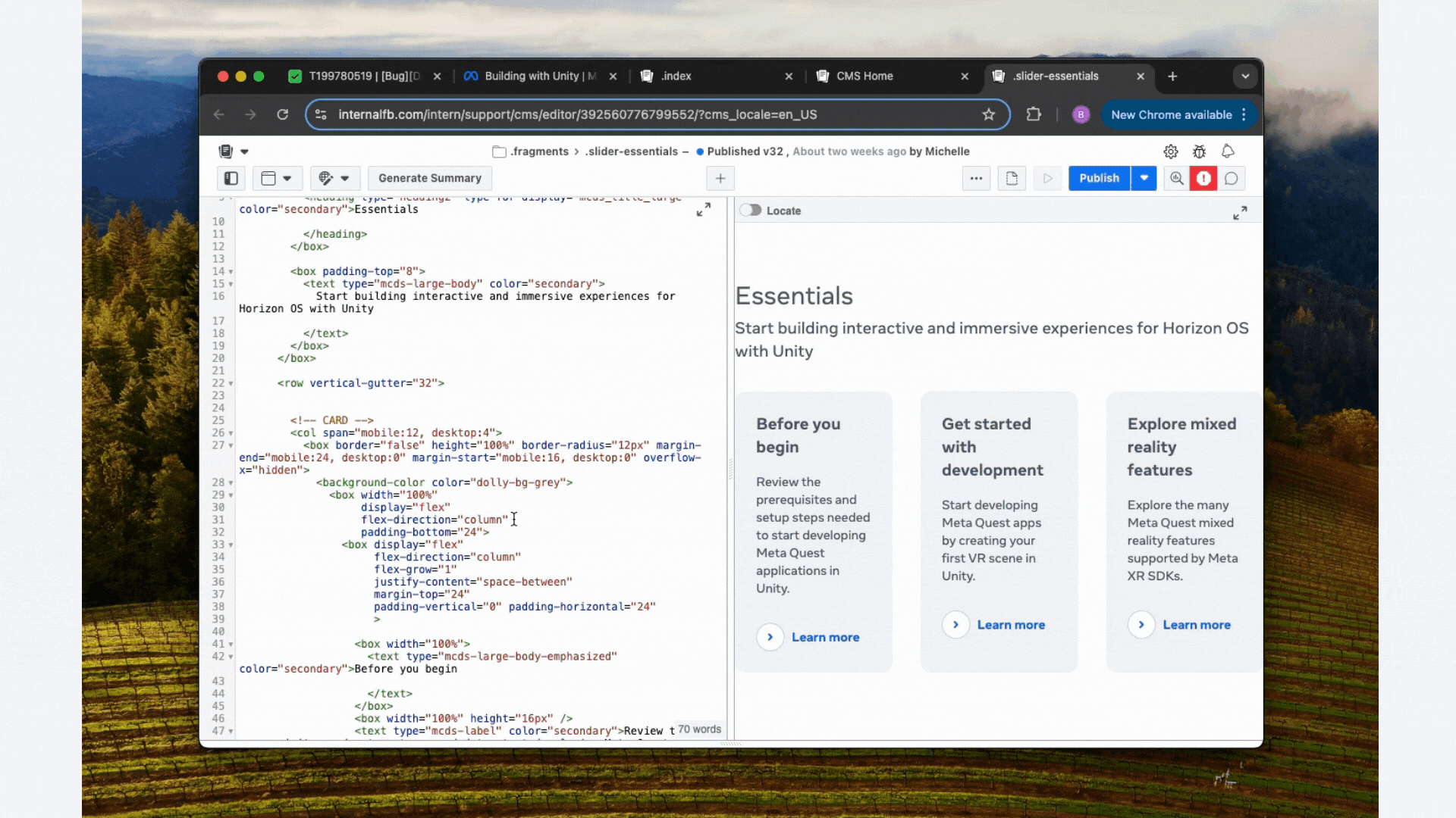
I discovered and resolved an issue where the 'Learn more' links on several cards on the "Develop" pages (Unity/Unreal Engine) were redirecting users to incorrect sections (Figure 1). This involved debugging the link logic within the CMS and updating the `href` attributes to ensure each button led to its intended destination (Figure 2).
View Live Example
(Figure 1 - Before: Corrected 'Learn More' link destinations on the Develop pages)
(Figure 2 - After: Corrected 'Learn More' link destinations on the Develop pages)
Phanto Card Link
The 'Learn more' button for the Phanto card on the "Code samples" page was directing users to a non-existent page (Figures 1 and 2). I tracked down the correct GitHub repository links and updated the button accordingly, ensuring users could access this valuable resource (Figure 3).
View Live Example
(Figure 1 - Before: Resolved an incorrect link for the Phanto card, directing users to the correct GitHub repository)

(Figure 2 - Before: Resolved an incorrect link for the Phanto card, directing users to the correct GitHub repository)
(Figure 3 - After: Resolved an incorrect link for the Phanto card, directing users to the correct GitHub repository)
API References Layout
QA Engineers noticed inconsistencies in the layout of sections on the "API references" page (Figure 1). Working with the CSS (Figure 2), I adjusted the height and width properties to ensure a consistent and visually appealing presentation across all sections (Figure 3).
View Live Example
QA Engineers noticed inconsistencies in the layout of sections on the "API references" page (Figure 1). Working with the CSS (Figure 2), I adjusted the height and width properties to ensure a consistent and visually appealing presentation across all sections (Figure 3).
View Live Example
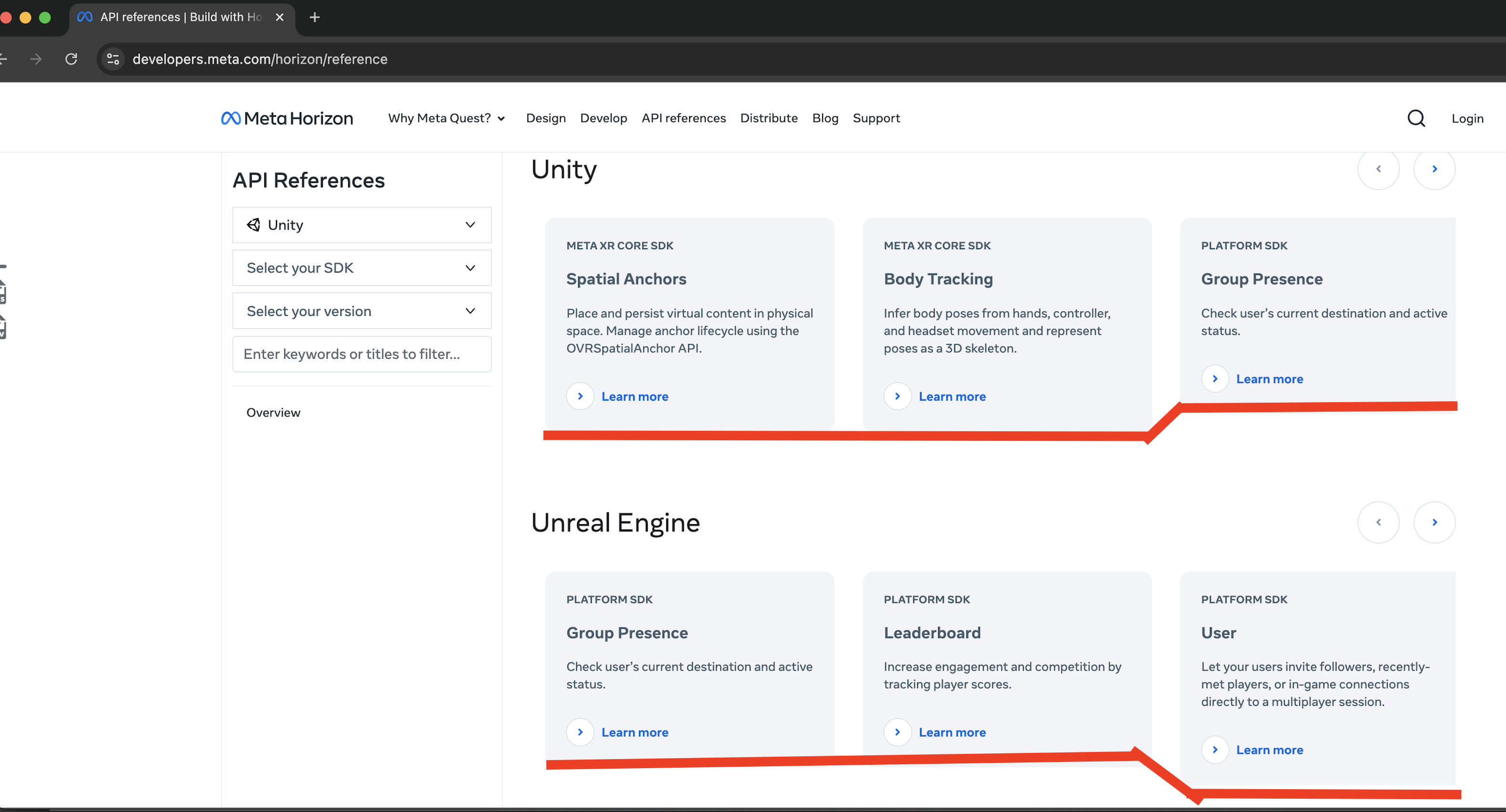
(Figure 1 - Before: Addressed layout inconsistencies on the API references page)
(Figure 2 - Process: Addressed layout inconsistencies on the API references page)
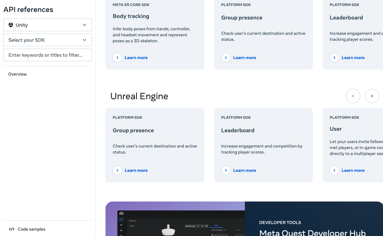
(Figure 3 - After: Addressed layout inconsistencies on the API references page)
Unity Page Alignment
On the "Develop" Landing page (Unity), QA Engineers identified misaligned 'Learn more' buttons and inconsistent card padding (Figure 1). I meticulously adjusted the styling in CMS to match the precise specifications of the Figma design (Figure 2), ensuring pixel-perfect implementation (Figure 3).
View Live Example
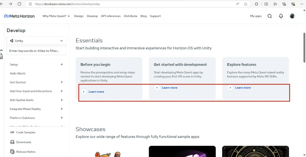
(Figure 1 - Before: Ensured precise alignment of elements on the Unity Develop Landing page)
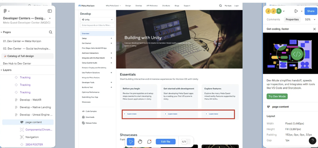
(Figure 2 - Design Spec: Ensured precise alignment of elements on the Unity Develop Landing page)
(Figure 3 - After: Ensured precise alignment of elements on the Unity Develop Landing page)
Icon Consistency
To maintain visual consistency with our design guidelines on the "Design (HIG)" page, I updated several icons on the design pages, replacing filled icons (Figure 1) with their outlined counterparts (Figure 2). This involved updating SVG assets and verifying their correct rendering across different browsers.
View Live Example
(Figure 1 - Before: Updated design page icons to outlined versions for visual consistency)
(Figure 2 - After: Updated design page icons to outlined versions for visual consistency)
These are just a few examples of the many small but crucial refinements I made during this phase. It was a hands-on, detail-oriented effort, driven by a commitment to delivering the best possible experience for our developers. It wasn't just about fixing bugs; it was about ensuring that the final product truly reflected the design vision and met the high standards we had set for ourselves. We conducted final rounds of QA testing, and collaborated closely with technical writers to ensure consistent, accurate and clear content and copy.
We wrapped up development phase with two days to spare before the launch at Meta Connect 2024.
![]()
We wrapped up development phase with two days to spare before the launch at Meta Connect 2024.
Challenges and Tradeoffs:
Tight Timeline
The 8-week deadline was the biggest constraint. We had to prioritize ruthlessly, focusing on the most critical features and content for the Meta Connect 2024 launch. We adopted a "Minimum Viable Product" (MVP) approach, knowing that we could iterate and improve after the initial release.
The 8-week deadline was the biggest constraint. We had to prioritize ruthlessly, focusing on the most critical features and content for the Meta Connect 2024 launch. We adopted a "Minimum Viable Product" (MVP) approach, knowing that we could iterate and improve after the initial release.
Legacy Content
Migrating and updating the vast amount of existing documentation was a significant undertaking. We had to make difficult decisions about what to keep, what to rewrite, and what to archive. We prioritized content based on usage data and developer feedback.
Migrating and updating the vast amount of existing documentation was a significant undertaking. We had to make difficult decisions about what to keep, what to rewrite, and what to archive. We prioritized content based on usage data and developer feedback.
Cross-Platform Consistency
Ensuring a consistent experience across different platforms (desktop, mobile, VR) presented ongoing design and technical challenges.
Ensuring a consistent experience across different platforms (desktop, mobile, VR) presented ongoing design and technical challenges.
Balancing Needs
Balancing the needs of new developers (who needed clear guidance) with the needs of experienced developers (who wanted quick access to specific information) required careful consideration.
Balancing the needs of new developers (who needed clear guidance) with the needs of experienced developers (who wanted quick access to specific information) required careful consideration.
Solution
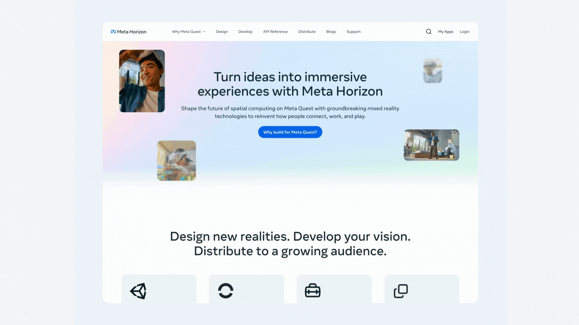
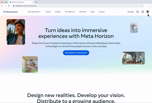
The New Meta Horizon Developer Center
The redesigned MHDC is a dramatic improvement, representing a paradigm shift in how Meta supports its VR/MR developer community. Key features include:

Intuitive Navigation
A clear and consistent navigation system, organized by developer tasks and workflows, makes it easy to find information.
A clear and consistent navigation system, organized by developer tasks and workflows, makes it easy to find information.
Consistent Branding
A unified visual design and consistent terminology create a professional and cohesive experience, building trust and confidence.
A unified visual design and consistent terminology create a professional and cohesive experience, building trust and confidence.
Powerful Search
A completely redesigned search engine, provides accurate and relevant results.
A completely redesigned search engine, provides accurate and relevant results.

Concise and Clear Documentation
Documentation is written in plain language, with clear examples, code snippets, and interactive tutorials.
Documentation is written in plain language, with clear examples, code snippets, and interactive tutorials.
Structured Learning Paths
Curated learning paths guide new developers through the platform's capabilities, providing a clear onboarding experience.
Curated learning paths guide new developers through the platform's capabilities, providing a clear onboarding experience.

Interactive Elements
The design incorporated more interactive elements, like the platform selection and feedback widget.
The design incorporated more interactive elements, like the platform selection and feedback widget.
These before-and-after screenshots illustrate the dramatic improvement in the user experience of the Meta Horizon Developer Center.
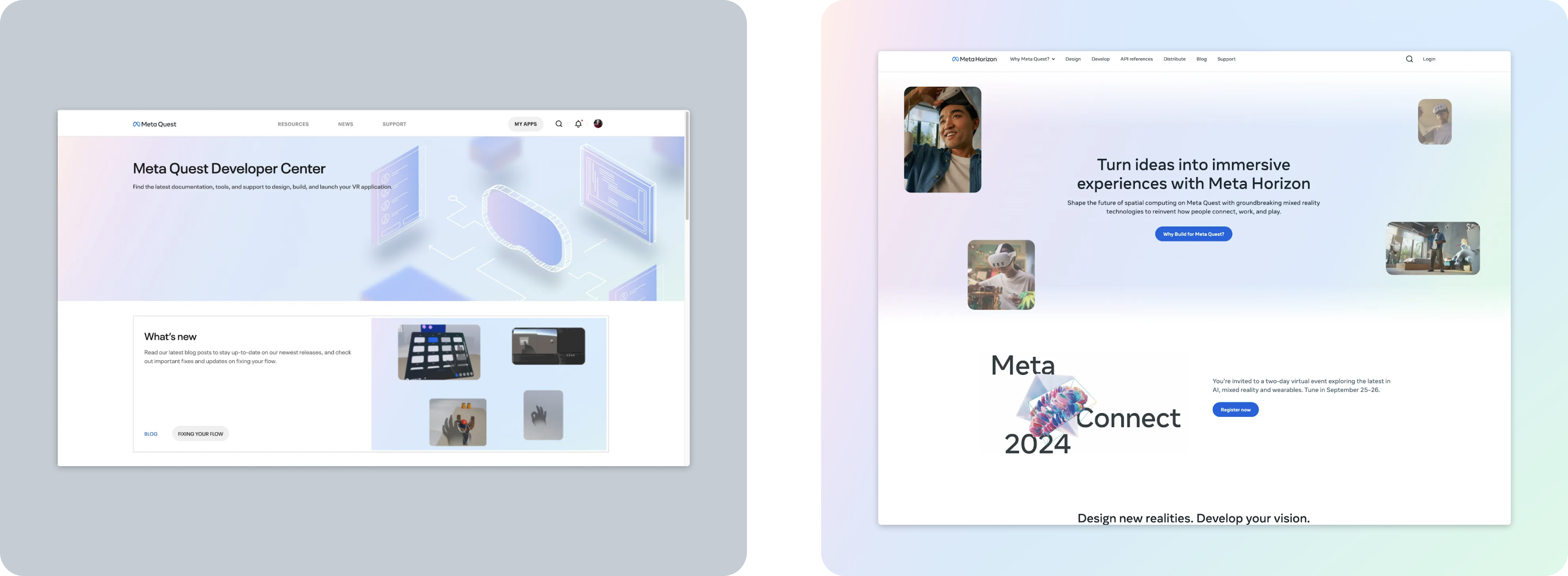
 DESIGN
Before (left): Outdated design, cluttered layout, confusing navigation.
After (right): Modern, clean, design reflectin Meta Horizon, improved usability.
 INFORMATION ARCHITECTURE
Before (left): Disorganized structure, difficult to find content.
After (right): Logical, task-based structure, easy to navigate and scalable.
 BRANDING
Before (left): Inconsistent branding, outdated domain (Oculus.com).
After (right): Unified Meta Horizon branding, consistent design elements.
 SEARCH
Before (left): Limited functionality, irrelevant search results.
After (right): Powerful, flexible search with improved relevance.
 MARKETING PAGES
Before (left): Image of the previous MHDC marketing page.
After (right): New content focused on onboarding and key use cases.
Outcomes
Reaching the Summit of Success
The redesigned MHDC launched to widespread acclaim at Meta Connect 2024. We didn't just meet expectations; we significantly exceeded them, setting a new benchmark for developer platforms within Meta and the broader VR/MR industry.
Quantitative Triumphs:
- 991 total updates landed: 426 from Doc Eng, 565 from Eng/Product.
- 59 new design topics added.
- Learning Objectives (LOs) identified for 53 different product areas (out of a possible 63).
- Improved organization and standardization from 0% to 91% compliant features/guides (Unity only prioritized for Connect timeframe):
Analytics indicated a 35% increase in searches that returned a helpful result.
20% decrease in the amount of time users were spending on the search result pages.
Qualitative Accolades:
"The new MHDC is a game-changer! It's so much easier to find what I need, and the learning paths are incredibly helpful."
- Developer feedback from post-launch survey
"This is a massive improvement over the old system. The team has done an incredible job of making the MHDC more user-friendly and intuitive."
- Internal stakeholder feedback
Efficiency Milestones:
- Delivered all assets 10-15% ahead of schedule.
Lessons Learned
Navigating the Seas of Change
User Research is Paramount
Deeply understanding developer needs through rigorous research is essential for creating a truly effective developer platform.
Deeply understanding developer needs through rigorous research is essential for creating a truly effective developer platform.
Collaboration is Key
Close, continuous collaboration between design, engineering, content, and product management is crucial for success, especially on a tight timeline.
Close, continuous collaboration between design, engineering, content, and product management is crucial for success, especially on a tight timeline.
Iteration is Essential
Don't be afraid to iterate and refine your designs based on feedback. Rapid prototyping and testing are invaluable.
Don't be afraid to iterate and refine your designs based on feedback. Rapid prototyping and testing are invaluable.
Prioritize Ruthlessly
When facing constraints, focus on the most critical features and content first. Embrace the MVP approach.
When facing constraints, focus on the most critical features and content first. Embrace the MVP approach.
Advocate for the User
Always be the voice of the user in design and development decisions.
Always be the voice of the user in design and development decisions.
Moving Forward
A Continuing Voyage
The redesigned MHDC is a testament to the power of user-centric design and collaborative development. It's a platform that empowers developers to shape the future of VR/MR experiences, and I'm incredibly proud to have played a key role in its transformation. The launch is not the end; it's the beginning of a continuous journey of improvement, driven by developer feedback and a commitment to excellence. We will continue to monitor usage, gather feedback, and iterate on the platform to ensure it remains a valuable resource for the Meta Horizon developer community.