Breakerbox
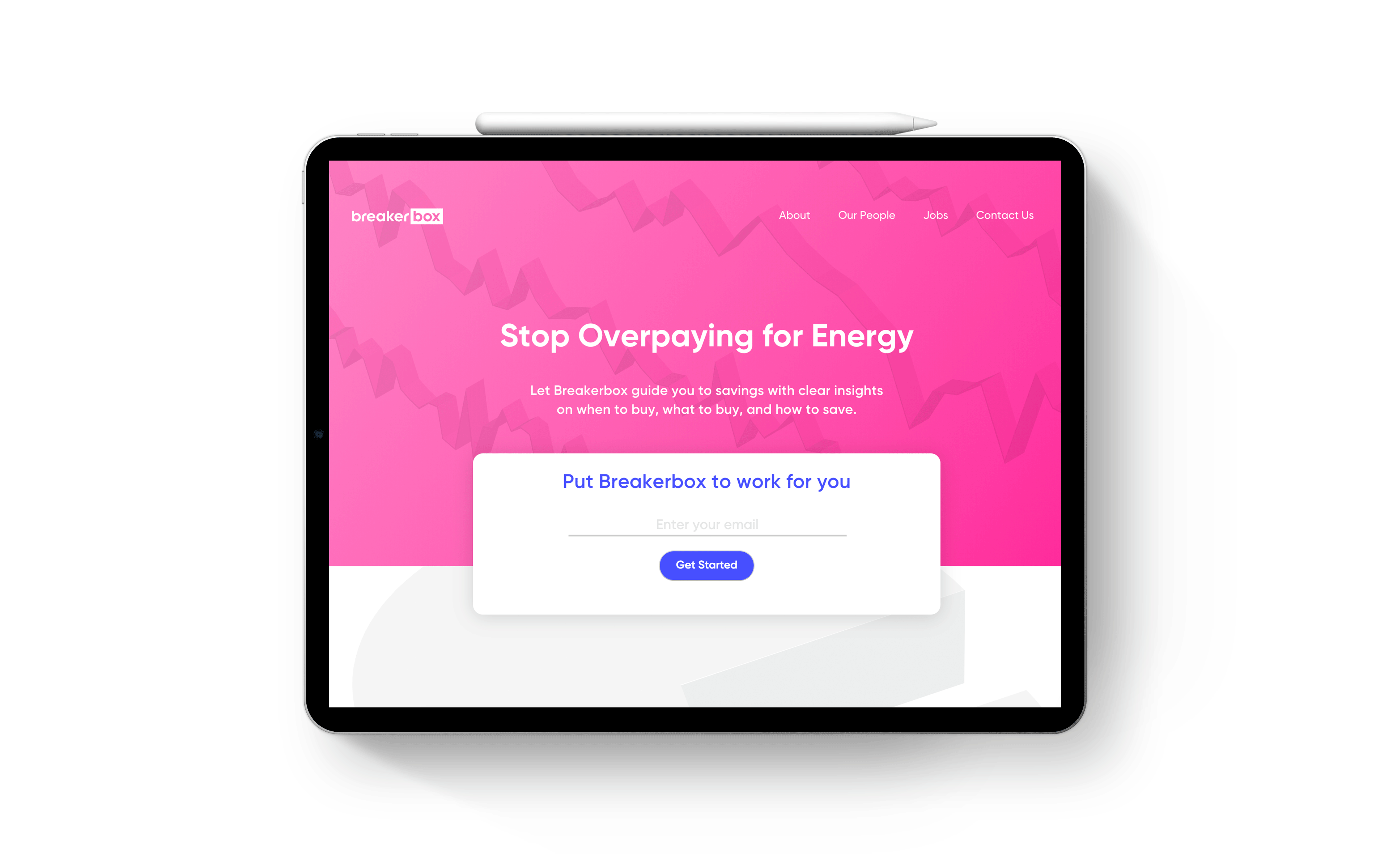
At Breakerbox — an energy consultant startup — I worked with the design team to bring one of IDEO CoLab’s first venture design projects from a concept to reality — a fully fleshed-out brand, ready to conquer the world. Collaborating with both a team at Exelon and IDEO teams, the Breakerbox crew iterated on countless versions of the product’s deisgn and marketing.
Role — Creative & Art Direction, Branding, Product Design, Illustration, User Research, Content Strategy, Front-End Development
The product
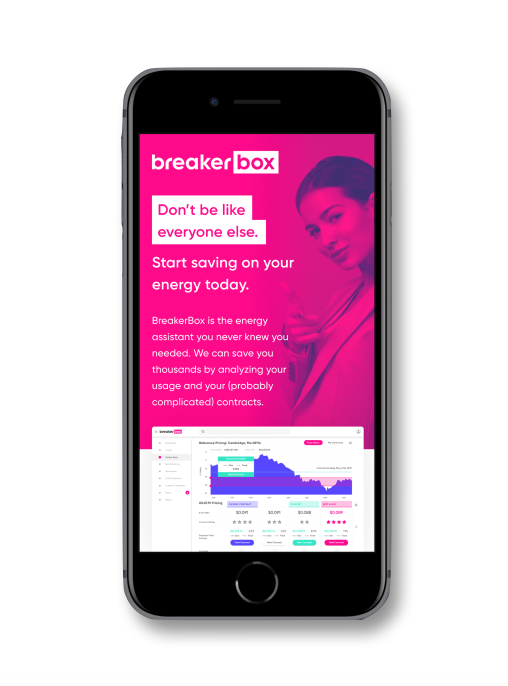
The Breakerbox product evolved from being a standard energy marketplace to a digital energy consultancy that brings concierge level service to a digital buying experience. The world of energy brokerage lives in the dark ages– paper contracts and bills, back alley dealings with brokers that have hundreds of uneducated clientele, and one-and-done relationships with energy suppliers. Breakerbox is meant not only to get small and medium-sized business owners the best price on your energy supply, but also take a holistic approach to the management of their properties. With usage monitoring and insights on how to invest in optimizing a location, Breakerbox brings a long-term relationship to a short-term focused market.
![]()
The Breakerbox product evolved from being a standard energy marketplace to a digital energy consultancy that brings concierge level service to a digital buying experience. The world of energy brokerage lives in the dark ages– paper contracts and bills, back alley dealings with brokers that have hundreds of uneducated clientele, and one-and-done relationships with energy suppliers. Breakerbox is meant not only to get small and medium-sized business owners the best price on your energy supply, but also take a holistic approach to the management of their properties. With usage monitoring and insights on how to invest in optimizing a location, Breakerbox brings a long-term relationship to a short-term focused market.
The visual style
I worked with other IDEO collaborators on the Breakerbox brand & visual style, testing different illustrattion styles and data visualization patterns to find the right attitude for the product.
Logotype

Color Palette

Typeface
Single source of truth
Near the beginning of my time with Breakerbox, we hunkered down creating a design system in Figma from my initial components, and together the team put together auto-flow components and accessible versions of our color palettes.

Putting the fun in functionality
Breakerbox has a wide gamut of data types to represent, and needs to feel light enough for the user to engage with the data rather than be overwhelmed by it. For this reason, we adjusted the Breakerbox visual aesthetic to embrace more rounded organic forms rather than our initial isometric styling. Initial designs were rigid and complex, while the newer ones were more simplistic, squishy and lighter, with more intentional color association and animation rather than having unnecessary moments that tended to distract during user tests.
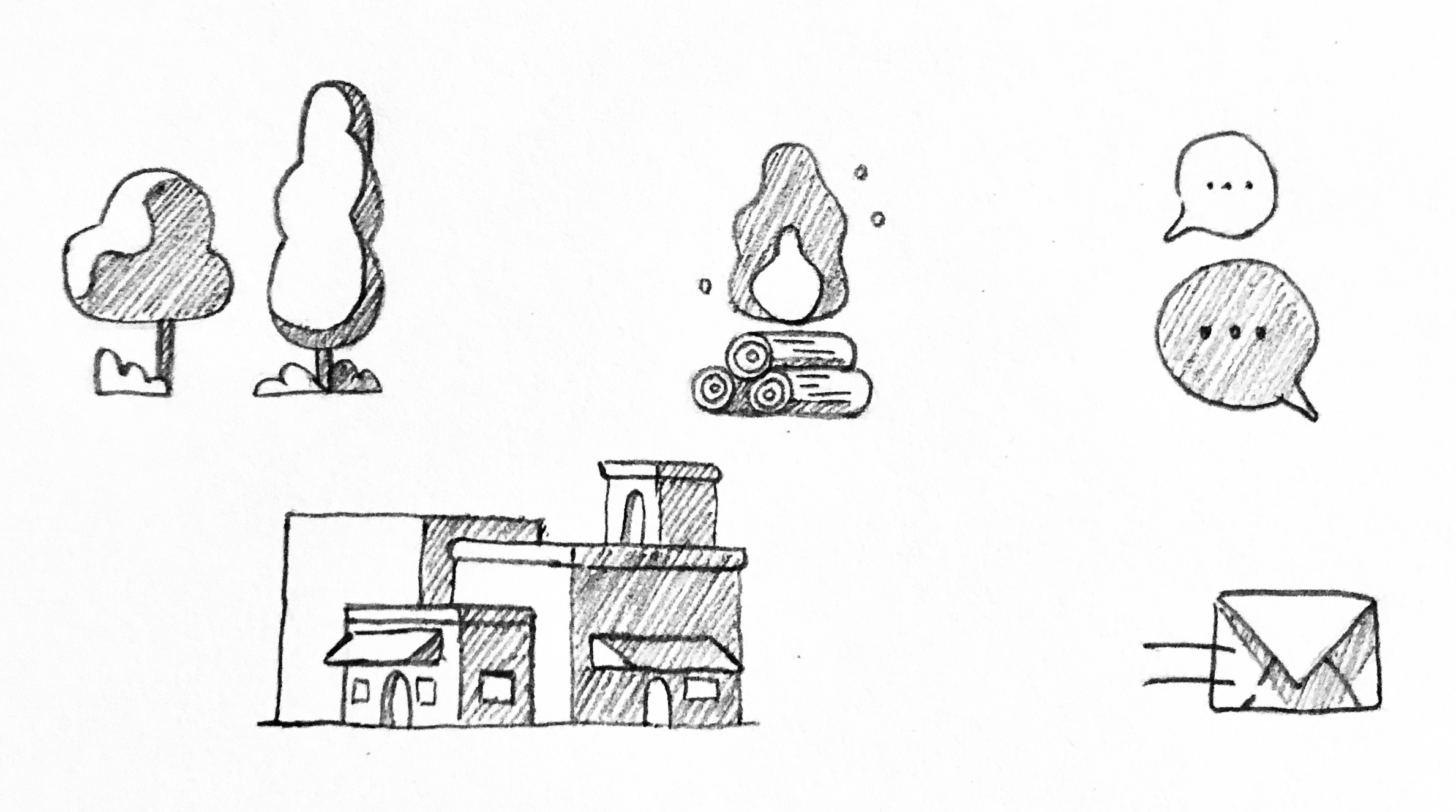
Iconography scribbles
![]()
![]()
![]()


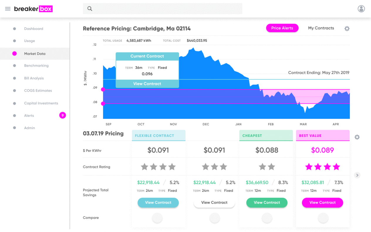
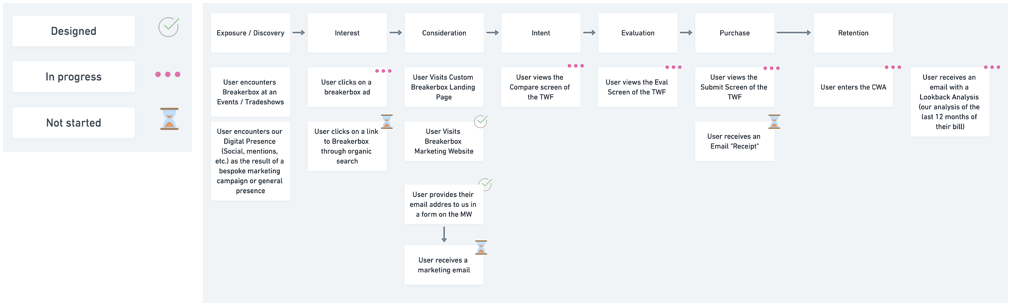
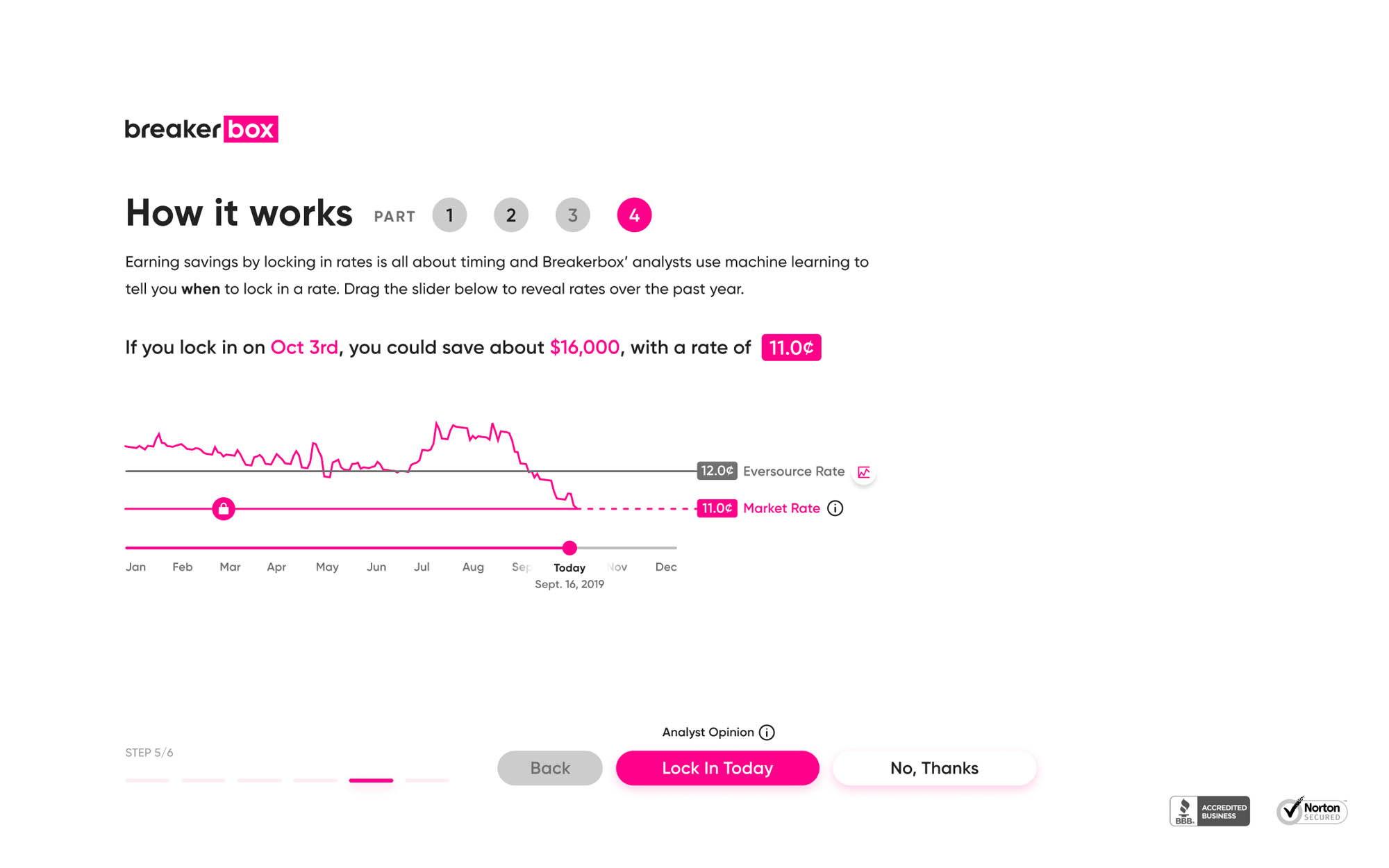
At the speed of thought
The day-one version of the product itself takes a simple location based on-boarding approach, moving away from a dashboard driven experience and more towards seeing a a personalized set of contracts with a tool set to guide the user to seeing what the best fit for them is. From here we I worked with subject matter experts to understand the user flow.
User journey mapping
![]()
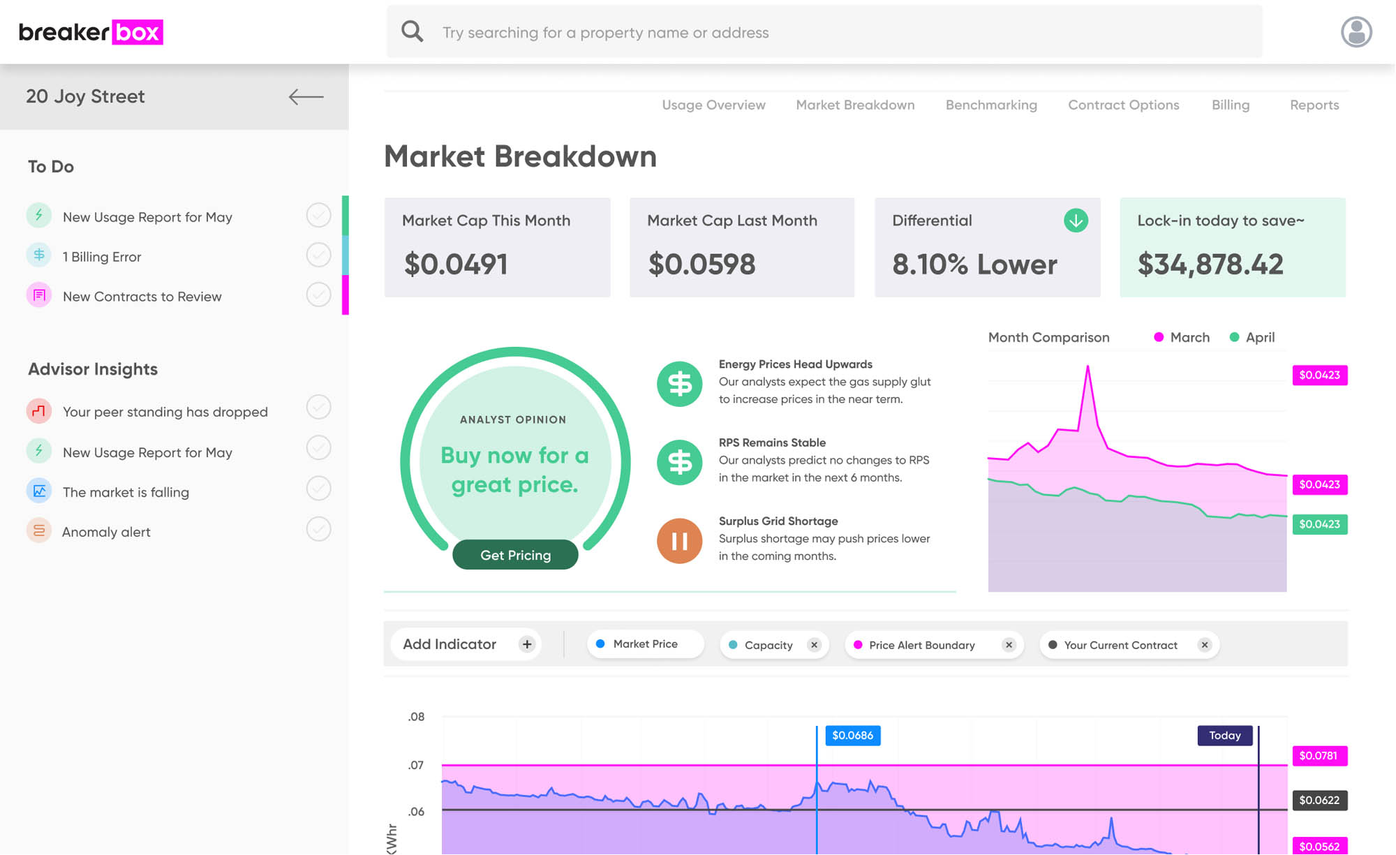
Iterative prototyping
We went through multiple iterations of this view over time, and even explored what it would look like after a users had purchased a contract.
Version 1
![]()
Version 2
![]()
Version 3
![]()
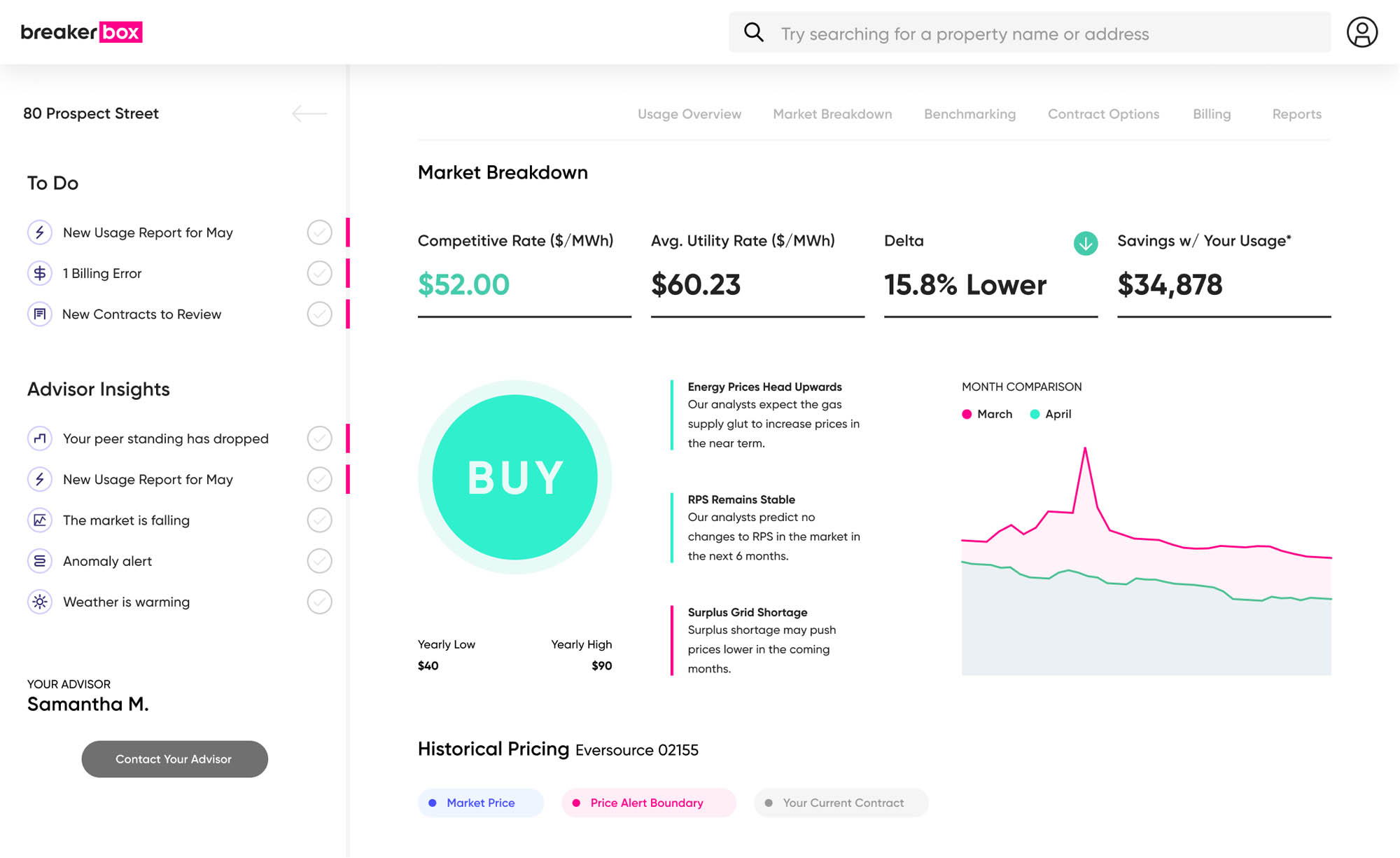
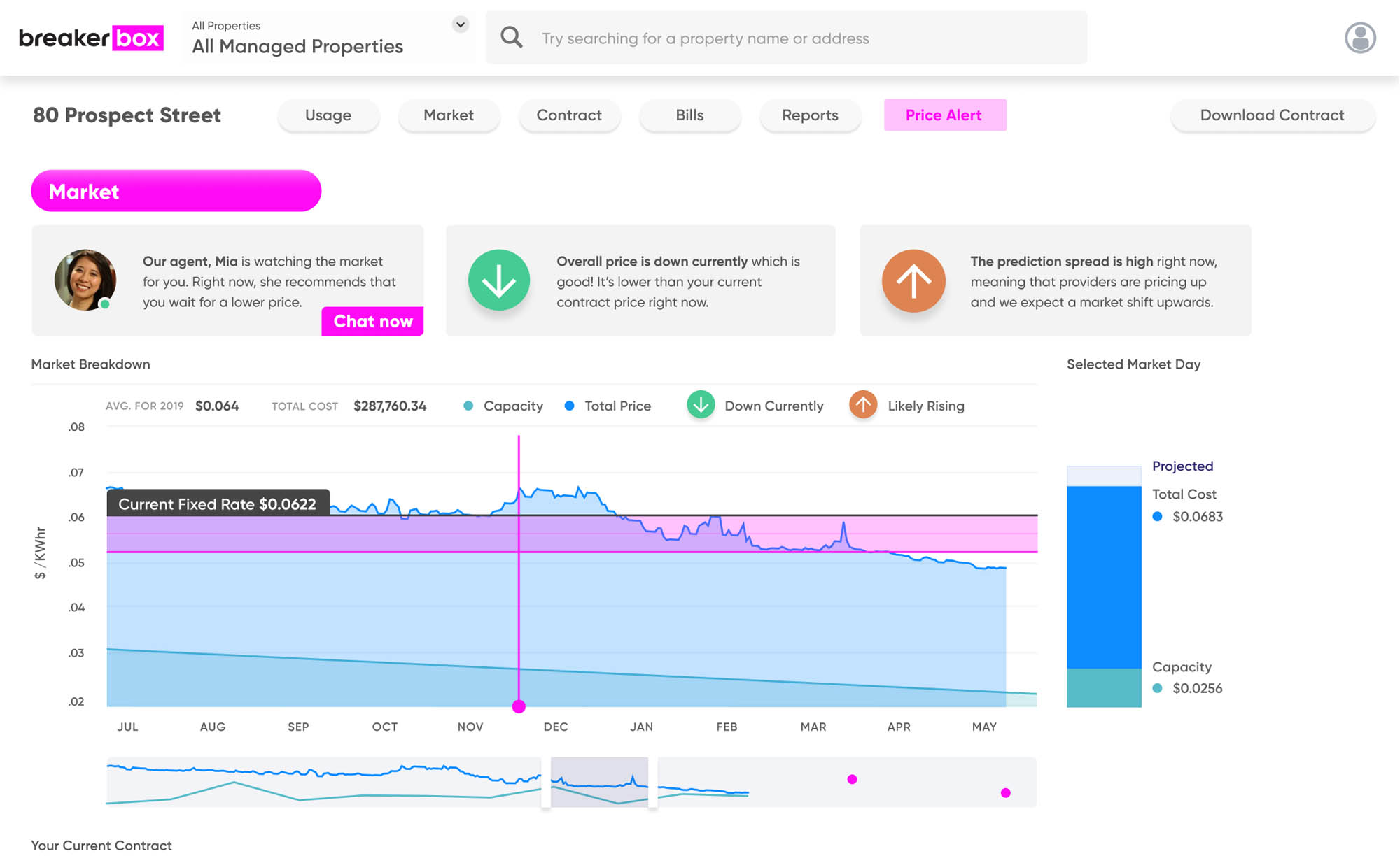
(Seeing market price)
Version 1
![]()
Version 2
![]()
Version 3
![]()
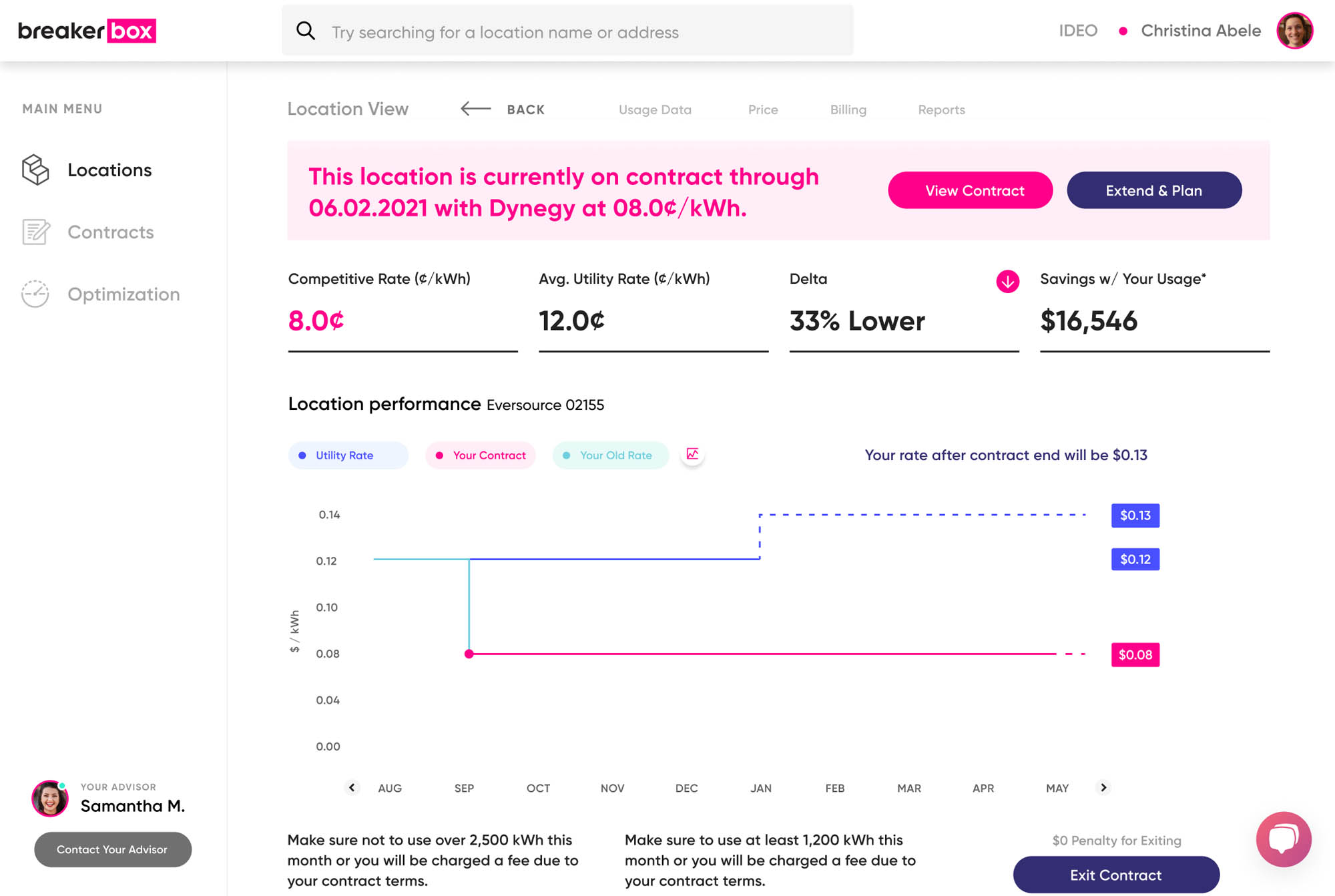
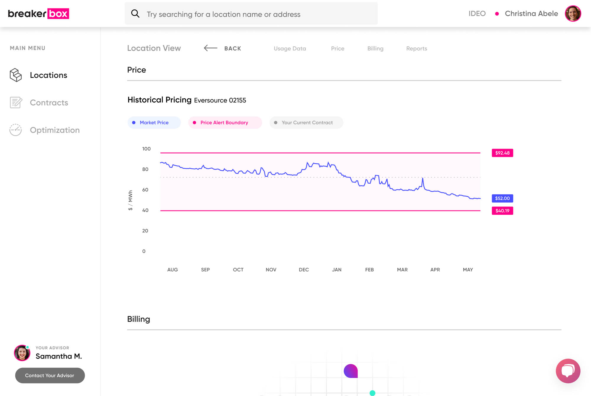
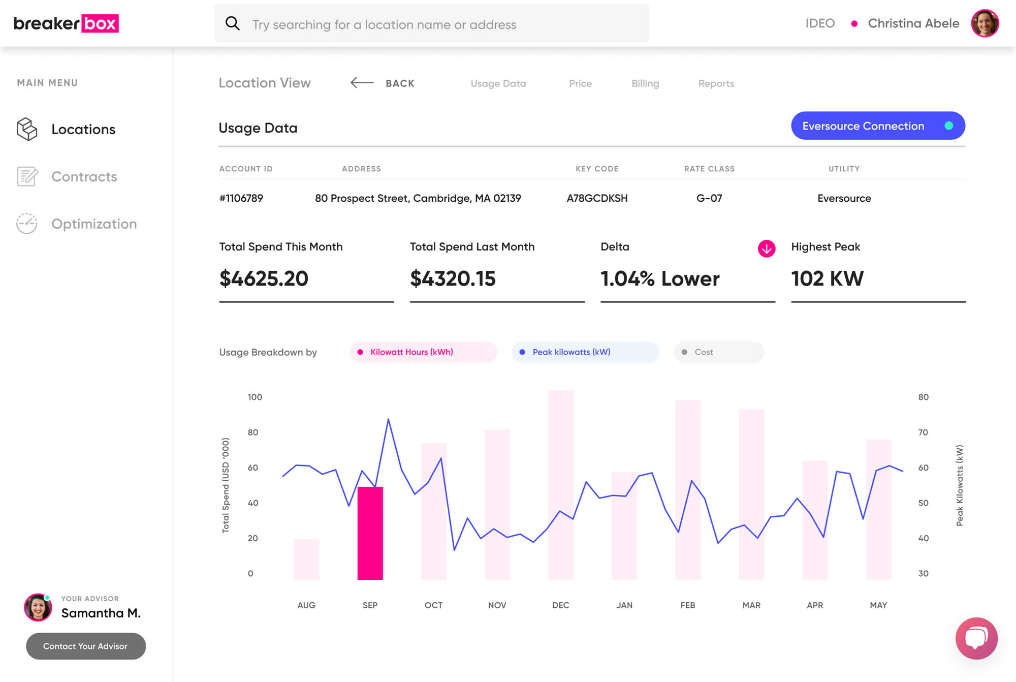
(Tracking usage)
Version 1
![]()
Version 2
![]()
Version 2
Version 3
(Seeing market price)
Version 1
Version 2
Version 3
(Tracking usage)
Version 1
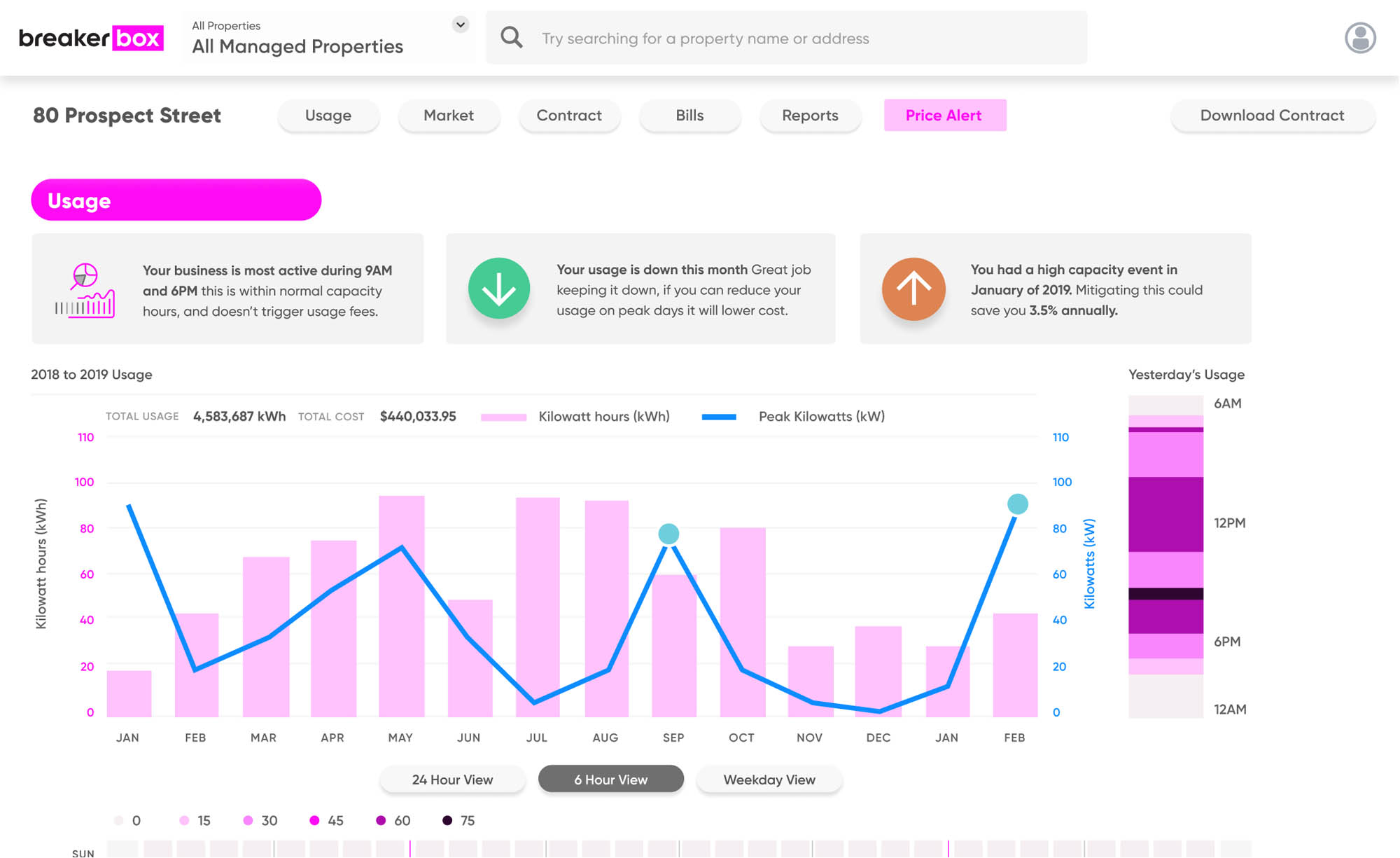
Version 2
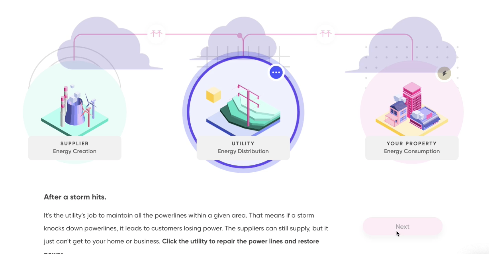
The energy explainer
Something that we struggled with during the design process was a disparity in the audience for our product. We tried creating many different versions of an explainer for the process, making illustrations and diagrams, a web animation, and finally found a set of simple illustrations and animations that got the point across rather quickly in a way that wasn’t too distracting.
It was fun!
Working at Breakerbox and seeing the brand come to life has been very rewarding for me as a designer. I'm really proud of what I've done here.
Figma web app prototype (ready-to-bake!)